Welcome to this week's blurb!
Welcome to this week's blurb!
If you're wondering if anything has happened just based on the banner, nothing crazy has happened. Just a couple of silly, shocked faces.
One brief thing I will note is that these banners are getting easier and easier to make the more I make with each blurb, they're fun to make and I hope you readers enjoy the banners as much as I do!
Now let's get into what the community has been up to this week!:
Impressive fleet and diorama of planes:

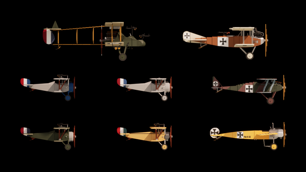 Credit: Rothary
Railroad bridge in progress (with a duck!?):
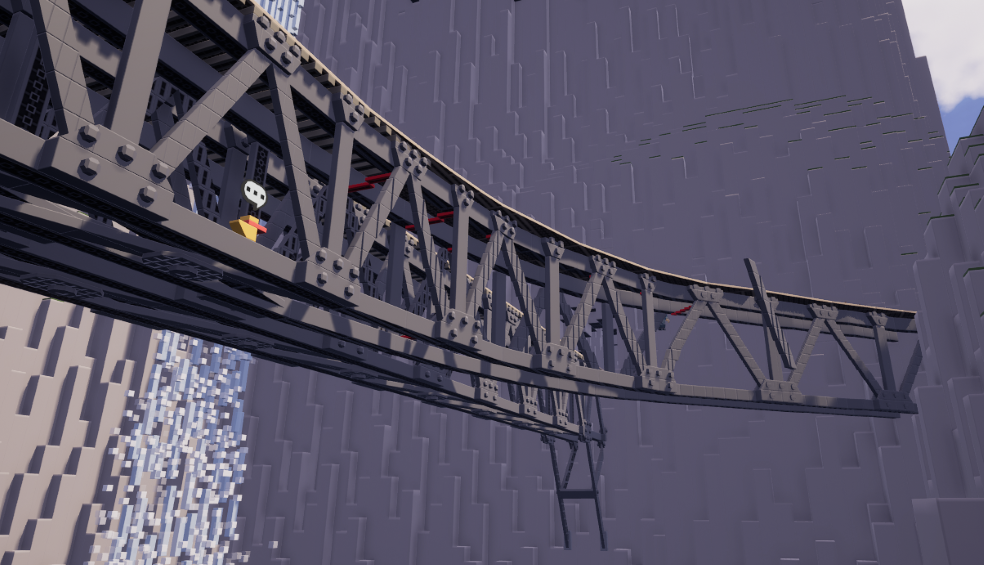 Credit: Bluester16 for railroad, Thingie for duck
Hallway with a cool brick shadow:
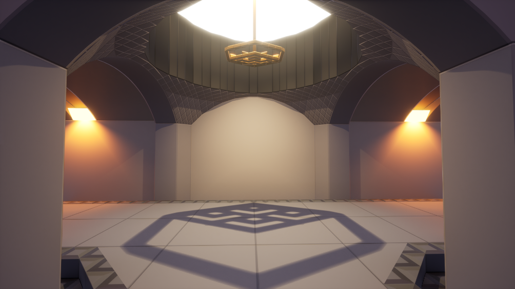 Credit: TombstoneTechnician
Colorful bird that lays cubical eggs:
 Credit: Moonkey
le bridge:
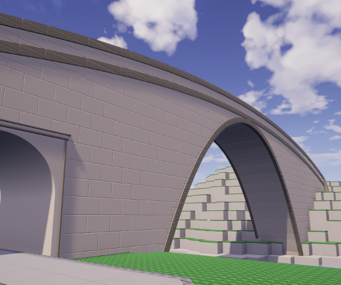 Credit: dhagrow
Brickitect sighting:
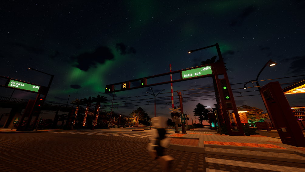 Credit: TheArmyGuy for the picture, Brickitect for their dithering corporeal form
Trains and terrain, if only we could see the trains move:
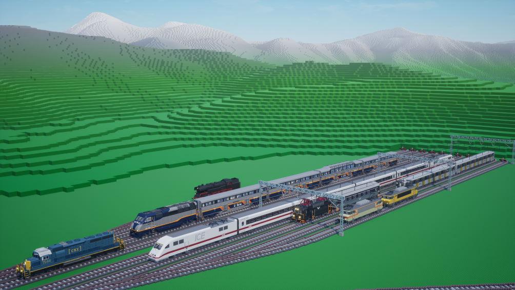 Credit: TheArmyGuy
The real crime here is that it isn't a 10.7 million brick bomb of microbricks:
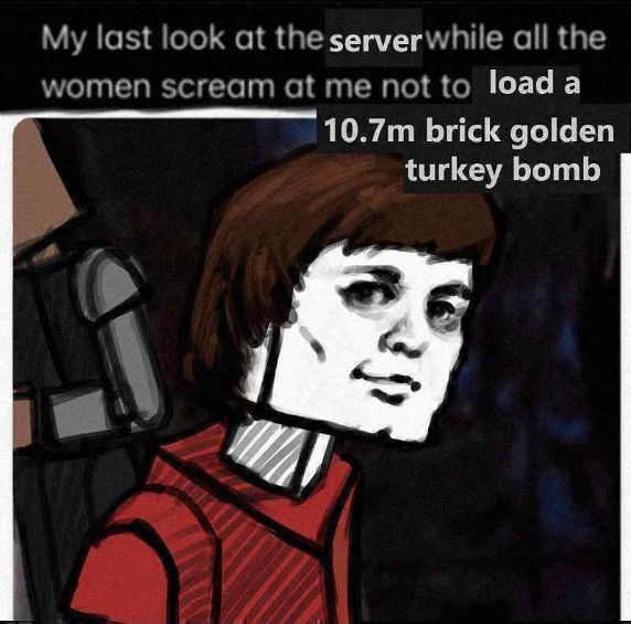 Credit: orion
Peecha wanchee lockhba tang nannee du chonky troy. Huuhuhuhuhuuuuu...:
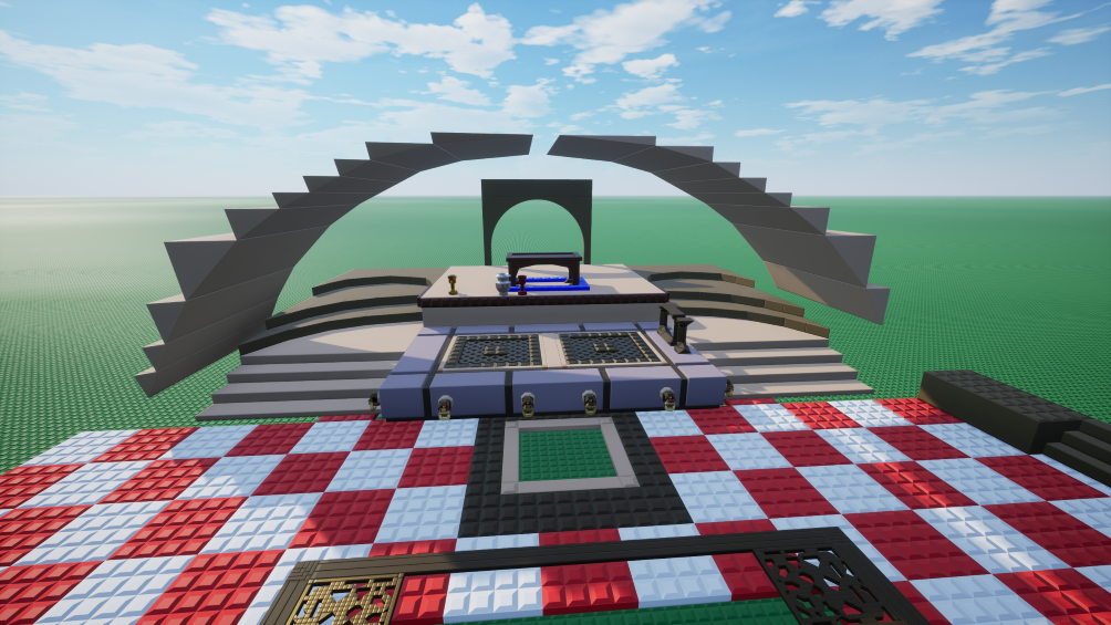 Credit: Cowboy Dude
Now I can accurately simulate my water heating and HVAC system!:
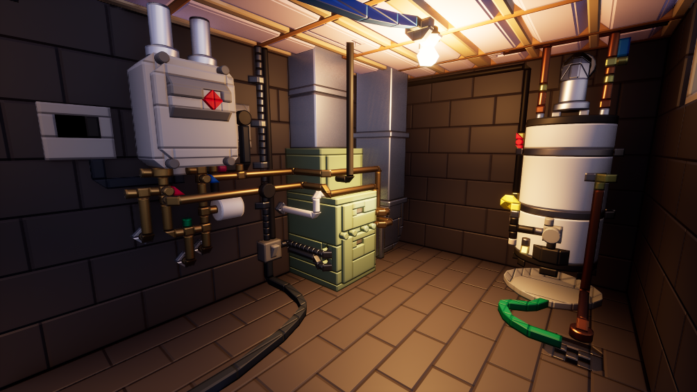 Credit: TombstoneTechnician
Egg is real now?:
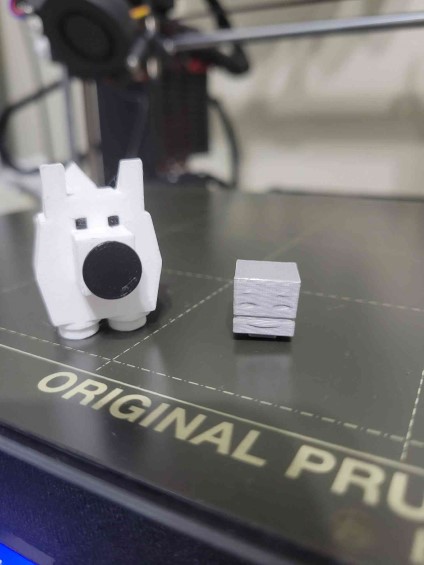 Credit: Smallguy
I'm pretty sure this is the scale a Game Boy game runs in:
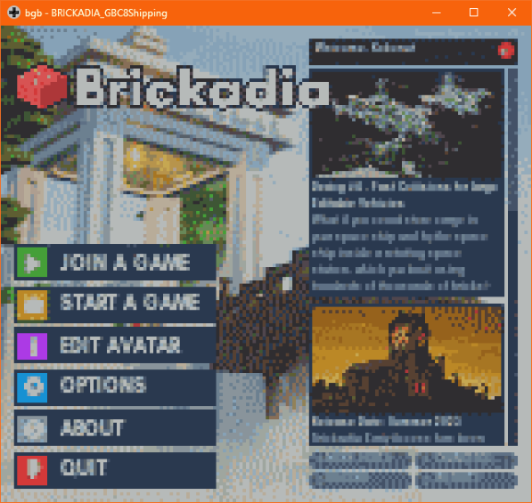 Credit: Kokonut
Extremely well-built gazebo:
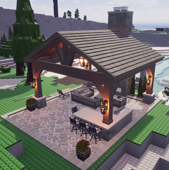
 Credit: Snabs
BLEGGster:
 Credit: SphericalCube for the image, Bluester16 for existing
*flashbang*:
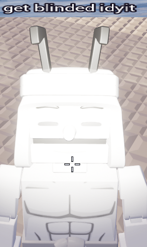 Credit: SphericalCube for the image, beecarbonate for being blinded
A place where anyone can lose their life-savings:
 Credit: Cryptic Runner
Now we arrive at this week's user column!
Each week I will be asking members of the Brickadia community a question relevant to Brickadia at the moment, whether that be in regard to development, speculation, or even just hopes and desires surrounding the game itself.
The question this week is:
What kind of music tracks or sounds would you like to hear in Brickadia?
"Personally I'd hope to see some piano tracks maybe, and stuff thats a bit more jazzy. I feel like the sort of lounge aesthetic that accompanies them is very valuable, and we already see lots of cozy and laid-back places where this music would fit."
"As for music, I would wish for somewhat calm classical music or piano such as Goldmund - Ouendake. It would be a good fit for tombs, old houses, monasteries. As for the sounds, falling bassboosted metal pipe would be a good fit as well for every single possible occasion in the game. Perfecto!"
"Racing music and sounds would be a pretty good addition."
During the release of the Physics Demo and the devblog, some information was dropped:
 Credit: Kenko
The main focus of this post by Kenko, who was the person that filmed the Physics demo, is the first part about the VFX of the Manipulator tool. For one, I forgot to clarify that this could've been a temporary effect of the Manipulator. However, it is very good to have clarification that this effect is very much so temporary, which could leave some speculation as to what the Manipulator tool's effect could end up looking like.
The second point in that response, however, is just more or less an issue of clarity on my part. I pointed out that it could be possible that cylinder pieces wouldn't be getting larger, however I meant that only in regard to the cylinder bricks we currently have, not in regard to wheels. It is perfectly understandable, however, that current microbrick wheels are just a stand-in for actual wheels in the future. Given that the post, however, highlights that it's not exactly known just how big wheels can get. Personally, I could totally imagine big monster-truck sized wheels getting in.
If anything, to avoid the issue of there not being enough wheels to fit the needs of all people, I could imagine there being some sort of dynamic wheel creation system where wheel sizes could be as big as you want through sliders and the like, with different parts of the wheel being partially customizeable like color, rims, tire width, bevel size, and so on and so forth. All that just so you can have wheels big enough for a construction haul-truck but small enough for a bike, or even office chairs! But now that's just my idea of a solution for that, there is no way to tell if something like that is actually being made.
What is actually being made however is this:
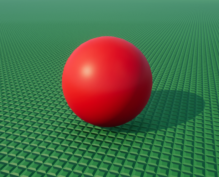 Credit: wrap
Whether or not this is just a literal joke or whatever is to be seen, but I would very much so imagine spheres are going to be implemented into Brickadia as they are very crucial for certain types of builds. Can't exactly play pinball, pachinko, or bowl with microbrick spheres, can you? The question, however, becomes whether or not spheres are resizeable on the spot or need to have different sizes implemented for it. As of right now, you can only resize cylinder bricks by extending the tube-end of the cylinder bricks, you can't resize the circular edge of the cylinder so that it can expand width-wise (which would be extraordinarily convenient as it is a little annoying switching to the build menu and back or filling up by build slots with different sized cylinders). For spheres, I would love to imagine that you can just expand the sphere in terms of resizing, but I would imagine that you'd also have to grab different sized spheres individually from the build menu.
Another thing to note is that a question was recently asked to Zeblote, the creator of Brickadia, about how the elevator platform in the Physics Demo trailer moved:
 Credit: Zeblote
This shows that as of right now, gears don't exactly exist yet in Brickadia and, in other words, aren't exactly possible in the way it was shown in the video. This also means that those gears were just moving on motorized hinges. However, it is quite interesting that that managed to pull that effect off with a motorized linear joint. To clarify real quick, it means that this:
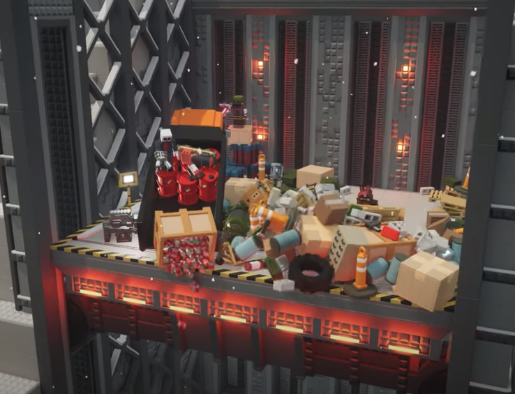 0:41 - Elevator being elevated (Source: Brickadia Physics Demo)
Was done using something similar to this, except only on a much larger, slower scale:
Credit: SixmorphugusOne of the big things I'm hoping for something like springs and hydraulic pipes, that would add great fluidity and liveliness to a lot of builds. Imagine being able to hop around on springs or have some sort of suspension on your vehicles! Moving away from that for a second, despite the fact that we don't have gears and that gears on a small scale aren't exactly possible, there may yet be light at the end of the tunnel:
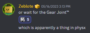 Credit: Zeblote (please ADD REAL GEARS, I'M BEGGING YOU)
Also, very cool thing, it would appear that the UI for Brickadia is getting a touch-up in the form of bevels
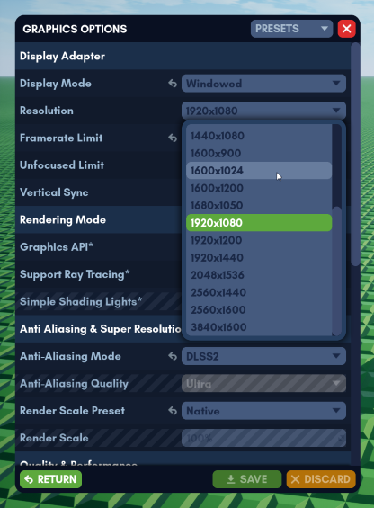 Credit: Zeblote
If we're expecting tabs like this, there's no doubt that using certain tabs like the environmental effects tab or the components tab is going to be a lot easier on the eyes. As a matter of fact, we have UI to compare with each other!
Old UI:
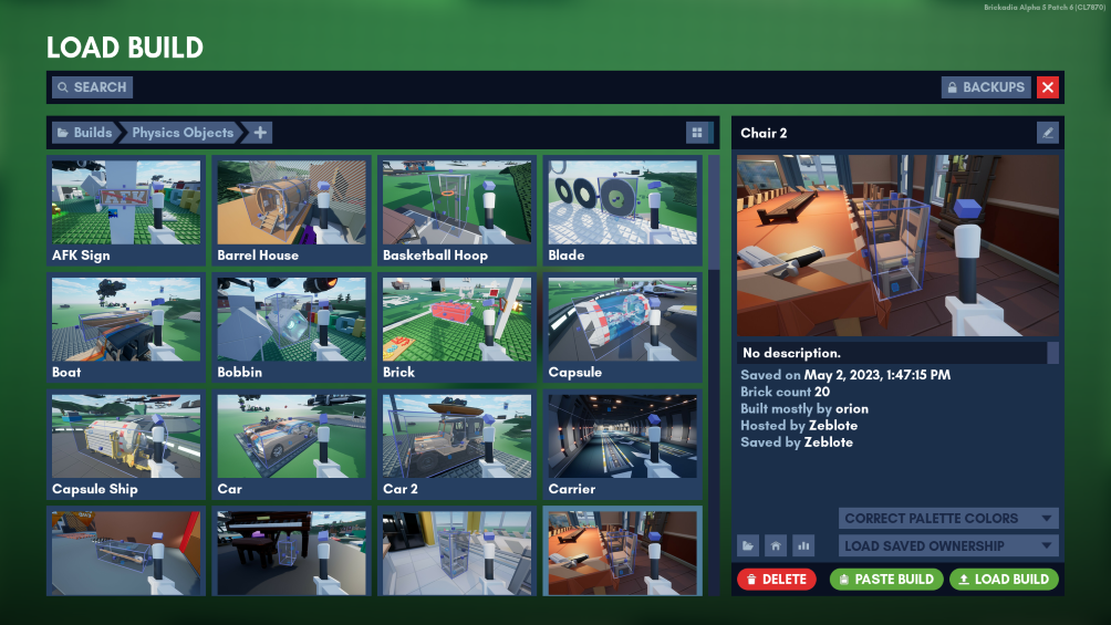 Credit: Zeblote
New UI:
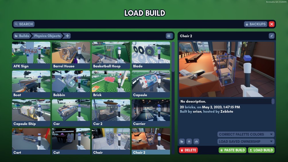 Credit: Zeblote
As we can see, there are some things different, the biggest obvious difference being the variances of bevels on all the UI squares. One thing to note is that the Load Build label is much more pronounced, a great help to remember where you were after you come back from the bathroom. The build icons are lacking the thick border in the new UI than the old UI, and pairing that up with beveling, that could make it just the tiniest bit more difficult to recognize certain builds. I believe thin border with bevels help keep the icons pronounced and more individualized. Another thing to take note of is the fact that the right side info-tab, which lists information about the build like the brick count, who built it, and so on and so forth, takes up more space leftward leaving the left-side holding all the build icons smaller. This does, however, make the preview icon a lot bigger!
One other thing to note is that, surprisingly, the way in which the information regarding brick count, save authorship, and the like are no longer listed one after another in a sort of bullet-point list-type way. There's no reason to assume that all of these design choices are final, and it could very well be the case that this is still being worked on, but one could imagine that when the brick count goes into the millions, has several authors, and is hosted by someone with a huge name that the new format becomes particularly unhelpful to the eye. However, there is some benefit to the information being simplified, mainly with some bits like "Hosted by:" being culled.
One last thing to note is that now with more space on the information preview tab, this leaves even more space for other things to be added! Though that doesn't necessarily mean more things SHOULD be added, one user in the community had suggested an idea about player information showing up on the player's list page:
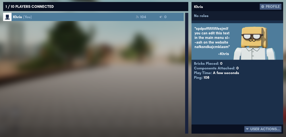 Credit: Khris
Very cool mock-up art for their idea of player previews for the player's list, and I could totally see this idea being implemented into Brickadia! However, I believe that with more space present on the information tab on Brickadia, this could also be incorporated into the information preview tab as well, where the appearance of the creator could be layered over the bottom right of the preview image for the build.
While we do have some bits and pieces on what Brickadia is probably going to look like once it comes out, there are still some bits and pieces we don't know, and I feel it's always fun to imagine the possibility of new features and tid-bits making it into Brickadia. But who knows, maybe we'll see some form of these ideas appear in the future of Brickadia, but only time will tell.
And that's all for this week of the durb blurb!
If you want to see your creations, ideas, and speculations highlighted on the blurb, contact me at: durb#3215