Welcome to this week's blurb!
Welcome to this week's blurb!
I bet you'd thought this week's blurb banner would be all artsy, but we're getting straight to the point.
For those of you that aren't aware, the developers of Brickadia released a new development blog detailing a lot of the behind-the-scenes improvements made for Brickadia as well as reworks, rewrites, and excruciatingly cool features! If you want to take a look before we talk about it a bunch in the speculation column, check it out here: Devlog #5 - Recent Graphics Improvements Roundup. As of thus far, this is probably the longest development blog written for Brickadia yet, so as a result if you plan on reading that blog on your phone, make sure it's on wifi and not data unless you want some pain.
Since this particular devblog is just actually long enough to where I need to look away from the screen for a second or two, this blurb is going to be SPLIT in half into a TWO-PARTER where we analyze the major details of the devblog and try to dumb it down for this one for us blurbiots, as well as briefly speculate on a few key take aways from some major reveals!
Now with all those shenanigans out of the way, lets take a look at what the community has been up to this past week:
Very stylistic stuff, yeah yeah:
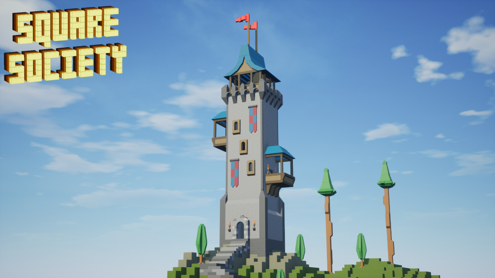
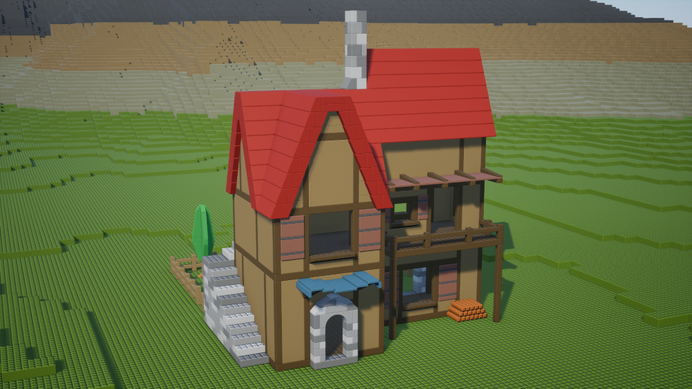
Credit: Londo
Me being dumb?:
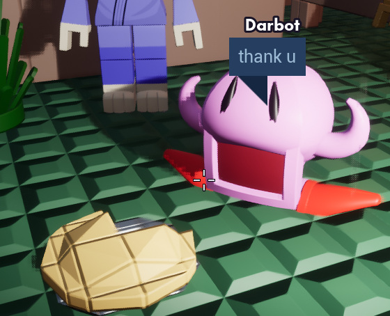
Credit: Aware
Some dogs took over a mountain? Let's hurry up with this.:
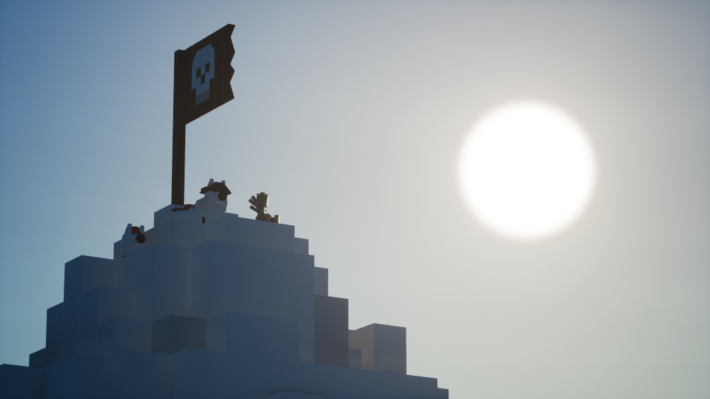
Credit: Pictures by Zoid, Brickadia City by Dingo Ananas
Mario & Luigi I guess, okay we're done with this:
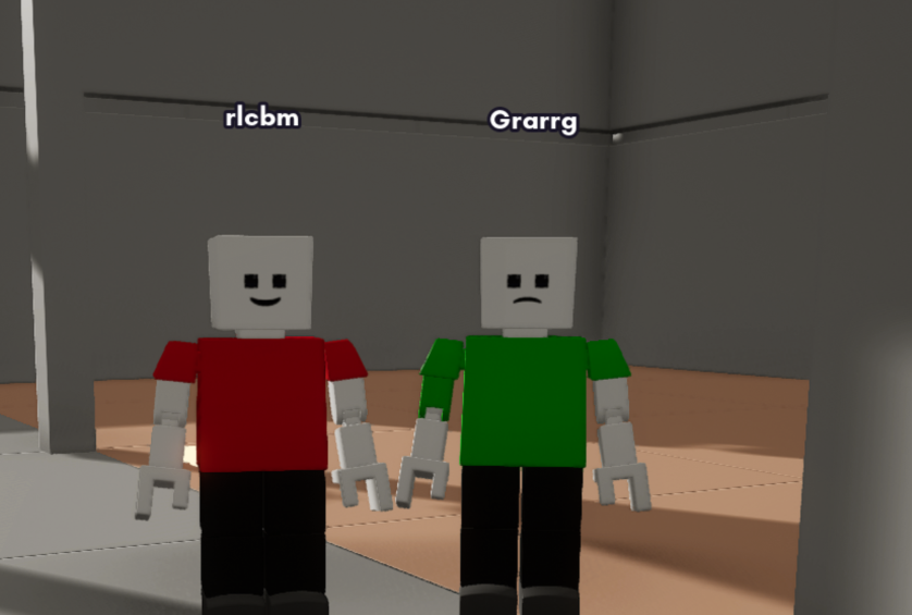
Credit: batterPatter
Okay, if we're cutting it THIS short, let's end it off with something nice: a Runescape import:
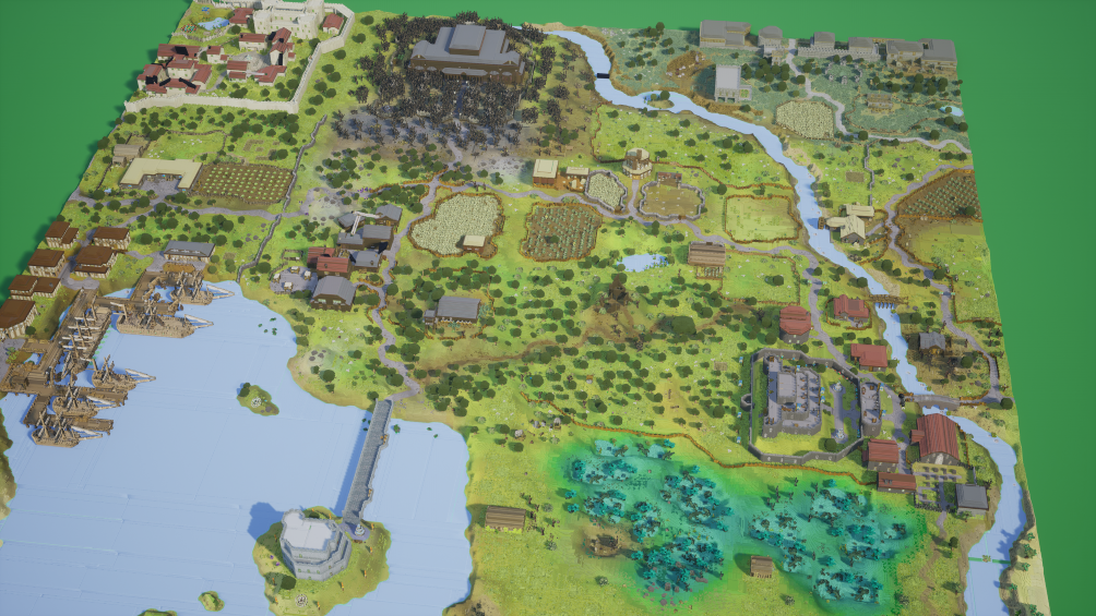
Credit: Smallguy
Now we arrive at this week's user column!
Each week I will be asking members of the Brickadia community a question relevant to Brickadia at the moment, whether that be in regard to development, speculation, or even just hopes and desires surrounding the game itself.
The question this week is:
That devblog, amirite? What did you like about it, and how much of it did you actually understand?
"I thought it was alright, I really wish they showcased behaviors and stuff more, I'm more interested in that than whatever graphical updates there are, but I understand that its just Zeblote doing the coding so its like his deal & his passions so. Also 1x microbrick."
"I quite liked it. Although development is slow and many people will tell you that, I'm happy that things are moving despite everything. The physics look cool and look fun to play with, and I especially like the environmental changes, and I can confidently say that I'm optimistic for the future. While I don't 100% understand everything going on inside the devblog, I'm happy that it's there for people to read and deliberate on."
"I understood quite a bit cause I'm a programmer nerd and man, Zeb is too goated."
And now for the weekly comic panel!:

Alright fellas, this is gonna be a long one, and I MEAN a long one. To put this into perspective, I wrote this BEFORE tackling anything else with this week's blurb, because it's going to be THAT long.
If you haven't read it already, I highly suggest reading the new development blog put out by the developers of Brickadia: Devlog #5 - Recent Graphics Improvements Roundup.
You done reading? Good, let's get into it with no time to spare.
Straight off the bat, the purpose of this blog should be quite clear. Unfortunately, there are NO new hats being showcased, neither are there new crazy things like vehicles or behaviors, this is specifically in regard to how Brickadia runs, as well as upgrades, improvements, and a surprise addition?
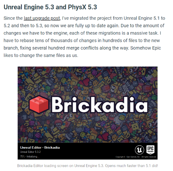
This whole segment of the development blog basically talks about the upgrade Brickadia has been given moving from Unreal Engine 5.1 to Unreal Engine 5.3, which, for many games, upgrading an engine can always provide some fixes and problems. This is a segway transition to talking about how Proto-Lumen had to be fixed. What is Proto-Lumen? As mentioned in Devlog #2, Proto-Lumen is essentially a middle-step between SSGI and Lumen, which is short for Lumen Global Illumination, which in itself is Unreal's very cool, dynamic, and fancy light reflection system. What was the issue for Proto-Lumen, however? While the devblog claims there were many issues, the one that was focused on for this one was the issue regarding velocity data being received. From what I gather, this basically helps with motion blurring for objects. However, another issue was in the fact that since async compute was turned on for NVIDIA GPUs, which is a feature that helps with multitasking (in agregiously simple terms), Proto-Lumen ended up going down a different code path. This segment also mentions depth pre-pass, which, to explain it in literal caveman terms, caveman look at cow, caveman record distance, caveman color cow next, caveman no color anything other than cow. . If you didn't get that, then that could be a problem you might to look into for yourself, but basically, Proto-Lumen goes to do something else because of a technical engine change for some GPUs, it's not using depth prepass anymore from the engine, and part of the solution is moving the dispatch for Lumen, the dispatch specifically being what starts all the shader shenanigan stuff.
Also, as mentioned in this segment, other people are interested in Brickadia's PhysX integration, which is basically how Brickadia uses PhysX. Only problem is that they need to clean it up before sharing it, to put it in short and simple terms.
I research and read-up, and a lot of this still flies over my head, meaning either I'm a bad programmer or I'm a REALLY bad programmer, lol.
MOVING ON:
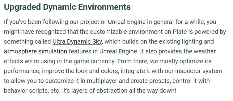
So basically, this segment talks about how they've basically upgraded the Unreal Engine asset they've been using for Brickadia's clouds and stuff after not having done so for the longest time, and in the process of doing so, have introduced probably one of the most visually spectacular things in this whole blog post: VOLUMETRIC CLOUDS IN BRICKADIA:
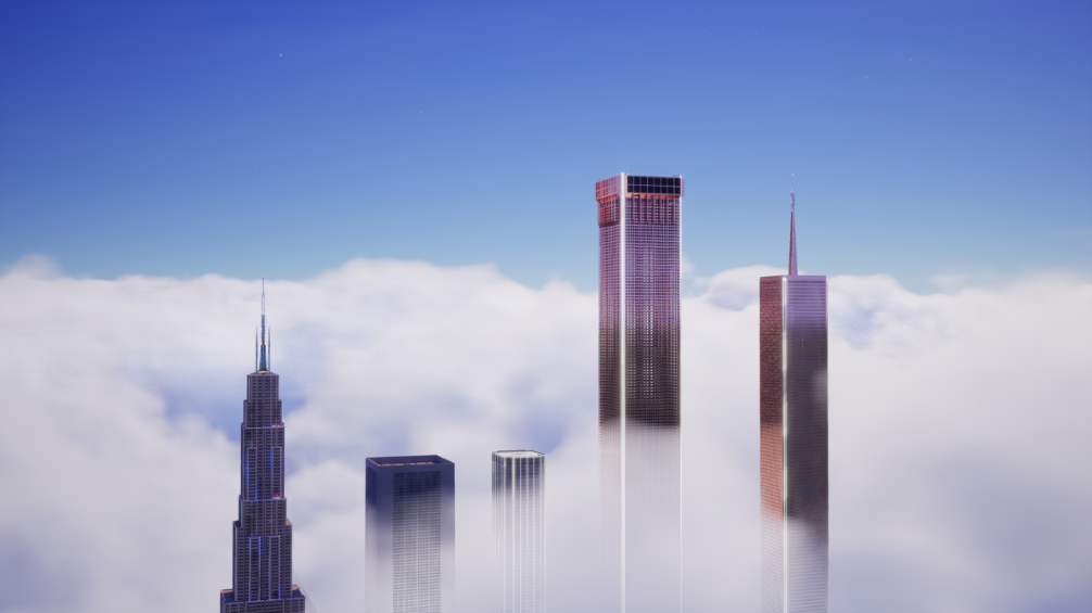
Picture yourself flying a ship, passing through great swathes of gas. Now imagine that plus weather, and imagine that with some added thunder now. Literally needs no explanation whatsoever, it's freaking awesome. Like, come on, do you really need to say anything else? What would be cool however is getting different cloud shapes or cloud "behaviors." Now when I say behaviors, I'm not talking about scripting, but wouldn't it be cool to have cloud release water very far away, or just have these crazy tall clouds that really put to scale just how small you are in the map? What DOES need explanation, however, is all the other stuff surrounding this, which would be the cool new environment stuff!
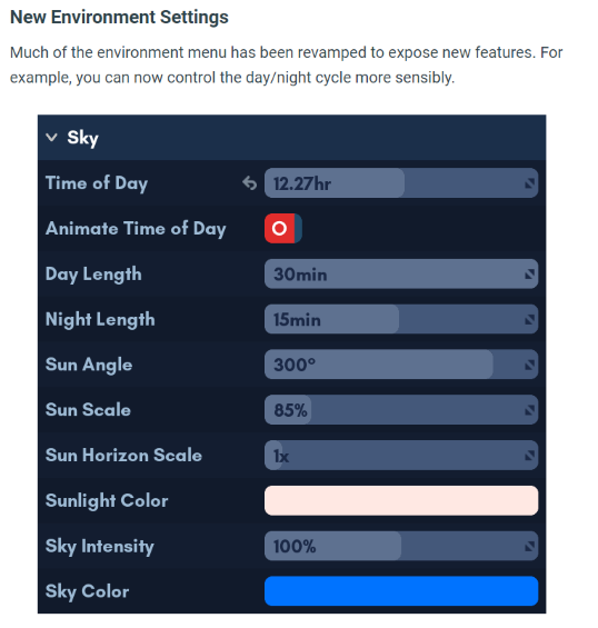
Generally speaking, the upgrades that were made to the environment UI for daytime was basically not having it be psychotic and detailing how long day and night can be, which, in itself, is a new addition as, previously, you weren't able to dictate how long day and night were separately. Not only that, the value used to measure the length has been turned into minutes instead of hours, which is a breath of fresh air, to be sure. On top of that, you can now adjust the moon phase at night, which will also affect the lighting for clouds at night. I can see many album covers being made with this new feature!
What would be a major thing to add though would be to add different sky phenomena into Brickadia for the night sky. Now last time I checked, there aren't really any shooting stars or comets, and while that sounds like a tall order, I'm not asking for a full space physics simulation, but the added feature of having those little things would be pretty rad.
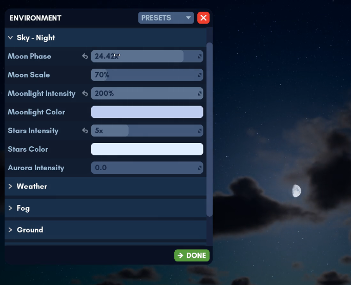
Apart from this, there are now distinct scroll-bars for specific weather effects, meaning you can whip up all sorts of crazy weather with the addition of angles now being added for them, meaning all Brickadia players will have to start angling their umbrellas to certain angles to avoid the rain:
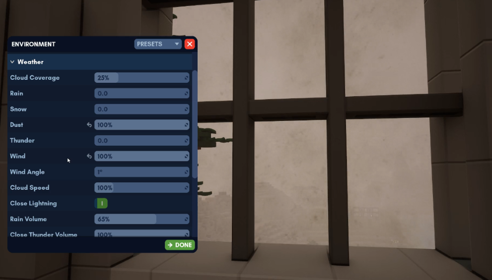
Now I, for one, would be a huge fan of having a scrollbar where you can manually edit just how frequent lightning is for thunder in a more precise matter (YES I KNOW THERE IS A SCROLLBAR FOR ONE BUT I WANT IT TO BE MORE SPECIFIC). While obviously there could be issues with too many lightning strikes, I would be a huge fan of that for very cinematic and chaotic environments.
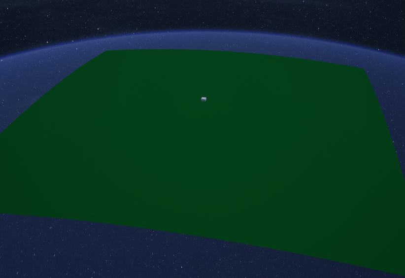
Flat-brickers must weep now for now they have been given the ultimate counter-argument; the world is now round! You'll notice the gray square in the middle, that is the whole map for Brickadia that you play in, so for those that are worrying about seeing the baseplate dip and having weird gaps under their bricks when they're super far, you need not worry since it doesn't dip within that range of the map. The reason the change was made? Basically, when you're high enough up in the sky, the horizon is very weird looking, so the roundness makes it seem more natural. Since the world is now round, however, it would be cool to see how the world looks out of bounds in the players perspective rather than the super-giga out-of-bound shot we got.


Looks nice, right? The one that looks more sensible is the round world one, and the one with the weird gray hemmorhage between the ground and sky is the flat world. Moving on, we got some technical evil: screen space reflections!
Now what is a screen space reflection? To put it simply, anything that is reflected that is currently on the screen for Brickadia. The issues with screen space reflections before? Reflections sucked. How? You get a weird cut-off for some of the reflection, and you'd kind of see that for a lot of reflections, such as if you represented water with shiny reflective objects like the creative genius I know you are. You can't even really see all of you in a reflection! Why do the cut-offs happen? Remember how I said that the reflections only consider anything that is on the screen itself? That means if your camera has more of the shiny brick water on your screen, then you end up with a cool build on top, and half a cool build as a reflection. So how do you fix that? They don't really fix that (and they can't really do that because of how that literally works), but they do fix how the edges for those reflections look. How do they do that? They basically make use of clip space, which, in stupid dumb durb terms, is taking that reflection and kind of manipulating it like how you would a 2D image (from how I understand it). Does it look any good? To be nice, it's alright. If you told me to look at it, I'd think us Brickfolk are living in a simulation (what do you be we're in a "server"?).
Now the LAST thing we'll briefly analyze is the glass order stuff:
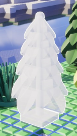
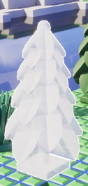
Above image, poopy brown. Bottom image? Now that's a tree I can hug. What's going on here? To boil it down in digestable terms, when you copy and paste builds, sometimes you can see the transparent bathroom when really you're supposed to be seeing the transparent door to the house more. In other words, you kind of get to see everything. Now it's fixed! How did they do that? The developers utilize a technique called Multi-Layer Alpha Blending. Now, this is a lot, so I have to explain this as simply as possible. Basically, they use this technique to fix the problem. I give up, I'm not explaining it any more than that. It goes so beyond me that this is the one time I have to concede, but what I can say on this is now you won't be seeing weird renders for your build being pasted onto the world. I'm just hoping that if custom decals or images somehow make it into Brickadia that it doesn't encounter the whole disappear-behind-glass problem that some games typically tend to have.
Stay tuned for next week as we talk about the next half of the devblog, especially the part regarding the release date of Brickadia, so look out for that next week!
And that's all for this week of the durb blurb!
If you want to see your creations, ideas, and speculations highlighted on the blurb, contact me at: durb#3215
You can also support me on my Patreon using this link here: Durb Blurb Patreon (www.patreon.com/durblurb)