Welcome to this week's blurb!
Welcome to this week's blurb!
If you're wondering why today's blurb took a little longer to publish today, well, you got your answer right here. Even though animation may seem very cool, the more frames you add, the more complicated things get. This is one of the few times where I decided to go beyond the traditional two-frame animation and go with four frames of animation just to have our funny little guy on the right have some smooth animation with the dust clouds. Now you might be wondering how in the world does a four-frame animation take so long? While it might be hard to believe, drawing four pictures with very particular differences to appear smooth and really get the illusion of movement down solid takes quite the amount of effort. Most other banners are usually the same image, just either redrawn, or they have very small moving parts, simple enough! But with animations like this where there are a lot of moving parts, such as the hair, the mouth, the ripples on the clothes, the dust clouds, there's a lot of planning that goes into that. On top of that, like a cherry on top, you have to color those frames!
So you could probably imagine that by the end of completing that banner, I was looking a lot like this:

So while I did complete the outline earlier this week for the banner, evenly distributing work on each frame took a lot longer than I had anticipated, and given that I have been a bit on the busier side this week, on top of having very little sleep for the past two days, after I completed the banner, I thought it'd be fine to just wait to release it later today just to get some shut-eye. I am fairly certain that anyone else probably would've done that given the circumstances, as I don't think I'd want to rush and publish a blurb right after completing the banner as 4 AM in the morning.
Cool banner this week though, huh? I grew up playing Dragonball Z Budokai Tenkaichi 2 (and yes, just so we are clear, this IS Dragonball inspired), and while I have not ever directly watched any part of the franchise to completion, I always have a bit of nostalgia and some memories playing games from the franchise. Reason why I bring this up is because I enjoy the art style of Dragonball, especially early on with how it was done by Akira Toriyama where you have soft, round edges for characters on top of great uses of hatching altogether for shadows or details. While Dragonball has an extreme amount of arcs, stories, plotlines, and different versions of Goku that I probably wouldn't be able to name off the top of my head, I chose to kind of base the setting off of Planet Namek, as that is the arc I am most fond of and most nostalgic of.
For this week's speculation, we'll be going over some of the development media just recently released by the devs regarding building UI, as well as a cool display of physics joints!
Now with all those shenanigans out of the way, lets take a look at what the community has been up to this past week:
So when are we getting a long-drooping nose cosmetic that isn't the bird beak?:
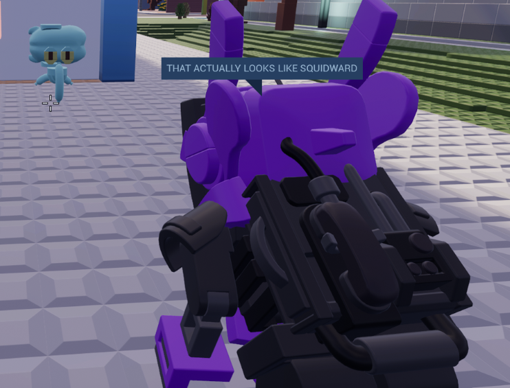
Credit: Lynn & Vix
I almost always feature drawings of Brickadia-related things on the blurb, I just have to:
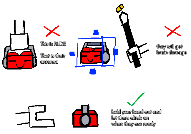
Credit: Niti
Component heaven, am I right? The addition of lights really helps to sell the scale of the ship:
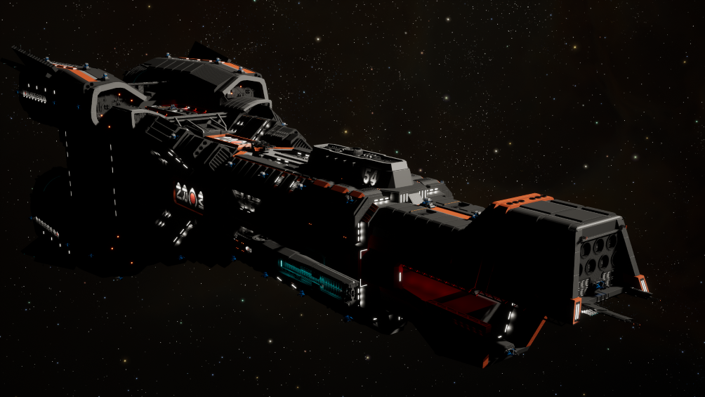
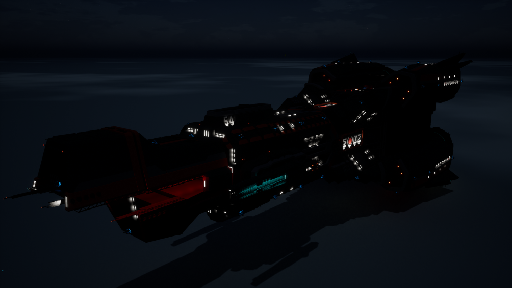
Credit: TheArmyGuy
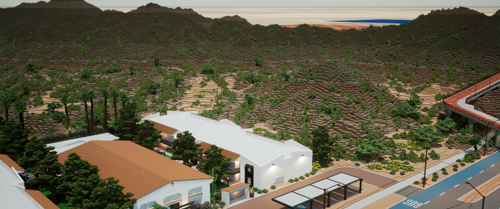
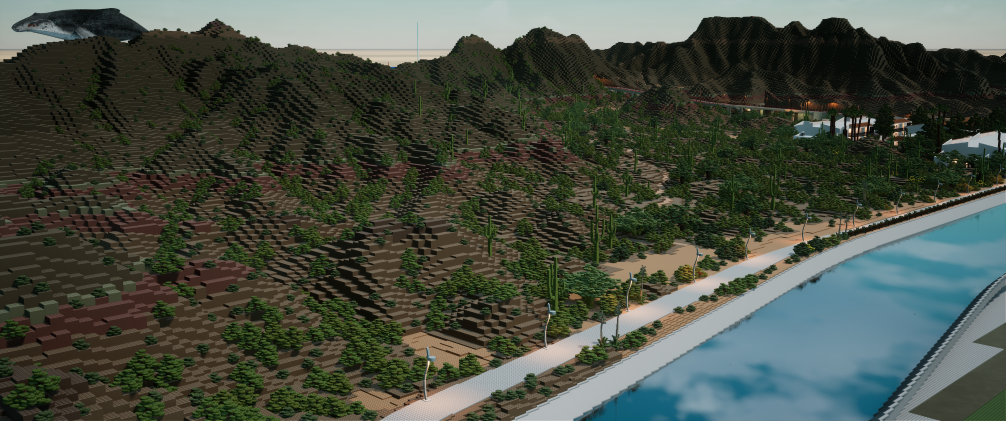
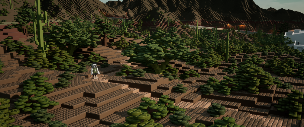
Excellent addition of foliage to Rockwell City!:
Credit: Brickitect
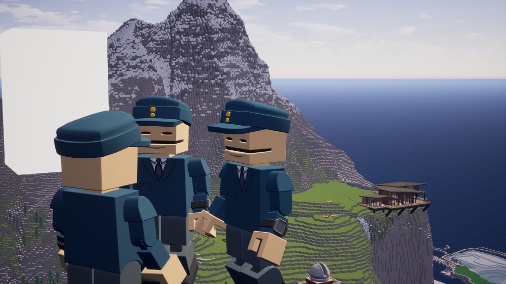
Last week? Hoogle mind-virus. This week? Bluester epidemic:
Credit: Bluester16
teh marioh and lugui in brigcadia:
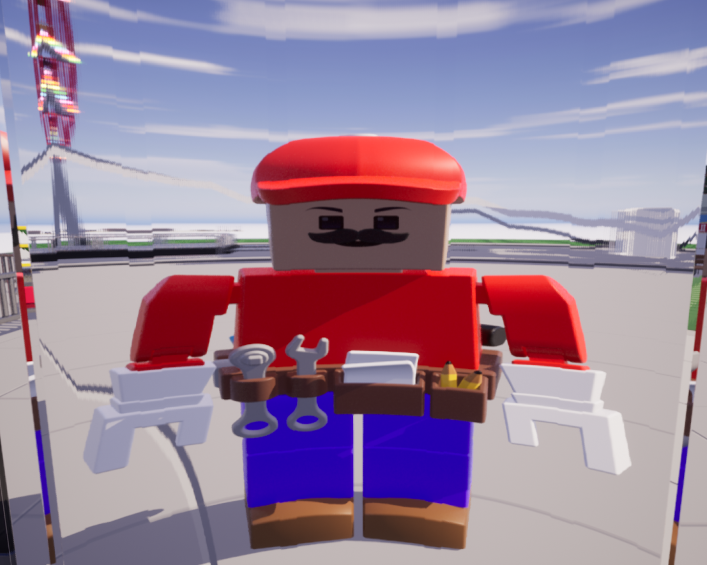
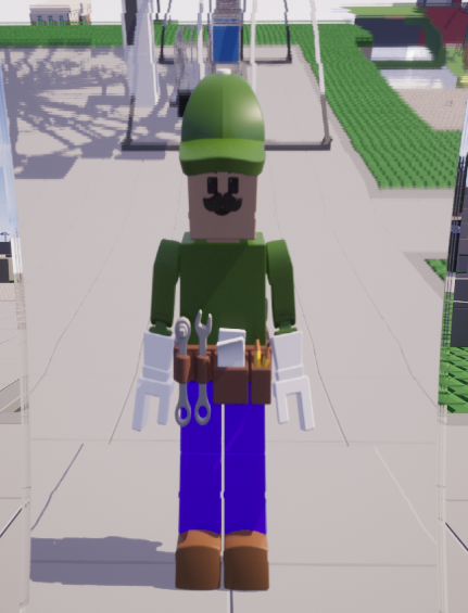
Credit: sofa
These share a very similar feeling:
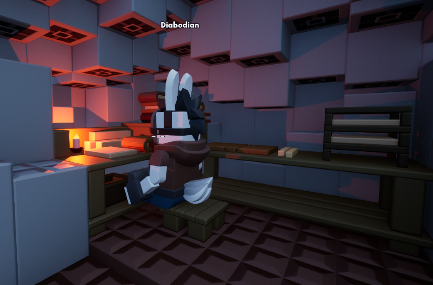
Credit: Dariacore
A compilation of face surgeries in Brickadia:
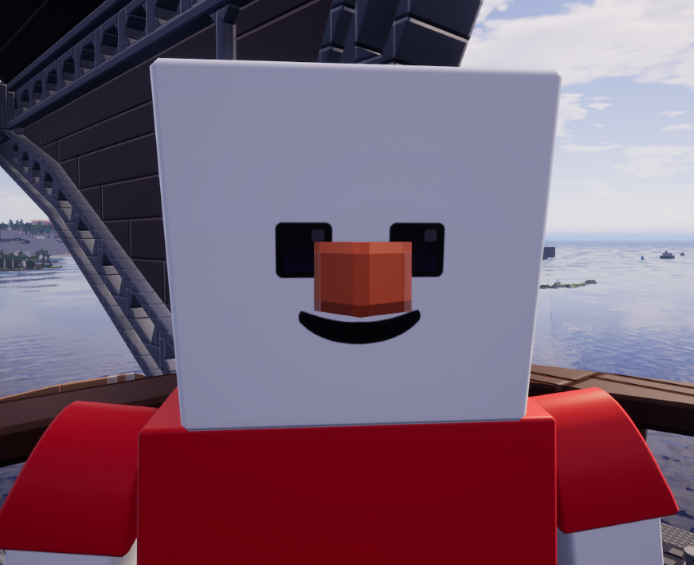
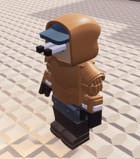
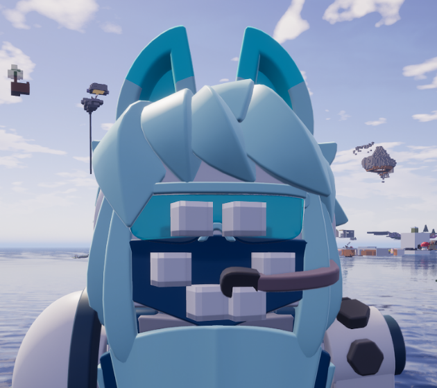
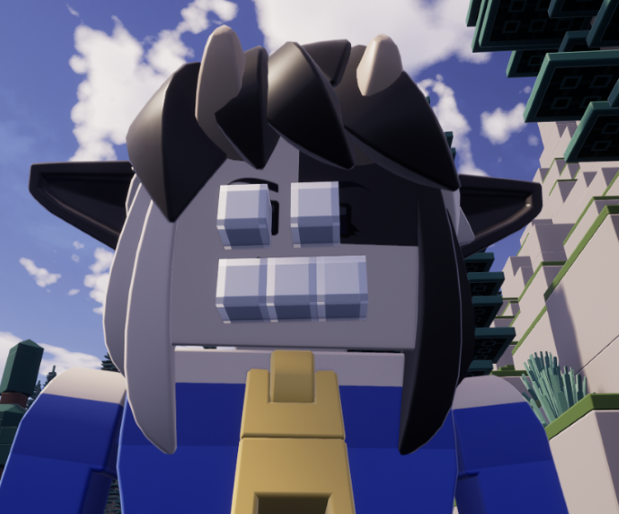
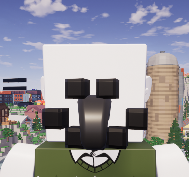
Credit: Thingie
Excellent shot of hot air balloons against the moon:
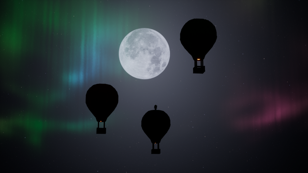
Credit: Zoid
What could a new map in Brickadia look like? While there aren't any new maps we know of in the making, we can take a look at this amazing mock-up of one!:
Credit: DessertSource
The one thing I love even more than drawings of Brickadia-related things are cosmetic mock-ups:


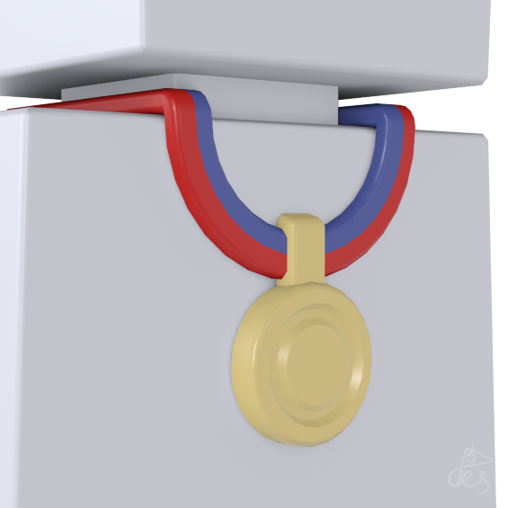
Credit: DessertSource
With how much DessertSource makes, I should honestly make a column where it's nothing but ideas for Brickadia, mockups, and whatever it might be. With that out of the way, ADD THESE TO THE GAME DEVS, PLEASE:
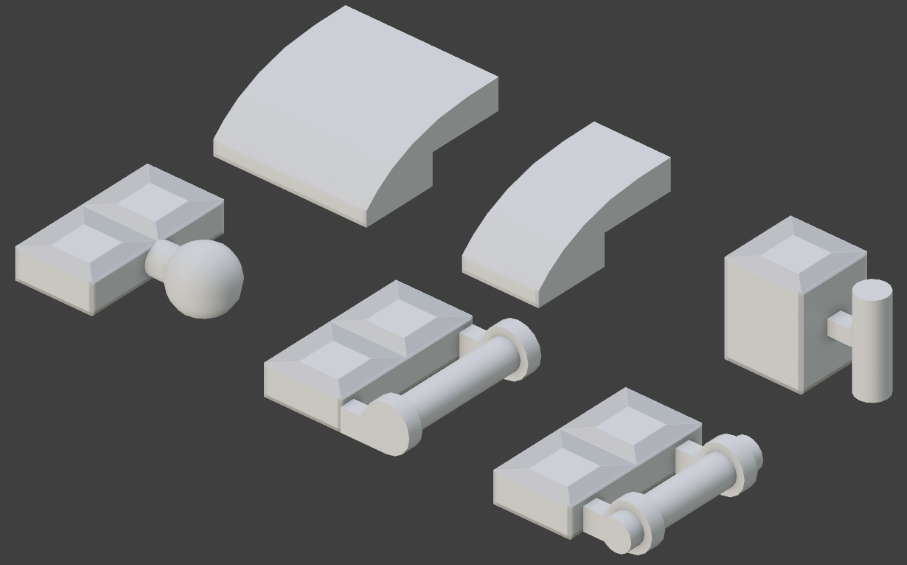
Credit: DessertSource
Yeah?:
Credit: Yeah, it's from me
pain:

Credit: AMD Radeon
Now we arrive at this week's user column!
Each week I will be asking members of the Brickadia community a question relevant to Brickadia at the moment, whether that be in regard to development, speculation, or even just hopes and desires surrounding the game itself.
The question this week is:
Do you think that the minigame system in Brickadia could be improved? What additions, changes, or cuts would you make to the system if you could?
"I think honestly Bricktionary as a whole could use some improvements, the custom word list feels too small to navigate and the same words keep popping up, it would be nice to have an option that prevents the same few words from showing up every 4 rounds."
"The minigames system in Brickadia is in a serious need of an overhaul. A lot of systems are very archaic and clunky and lack a lot of the capabilities that something like the Slayer add-on in Blockland had, and are also just not that user friendly. I think the biggest and most obvious change that needs to be had is to the lack of gamemodes. Brickadia right now only has 3 - deathmatch, bricktionary, and sandbox - and all of these have gotten stale (or are rarely used). Another thing that really needs to be added is team uniforms. This was such a huge thing in the old Slayer add-on system and it really helped bring unison to a lot of team-based minigames. A lot of settings need to be re-worked and/or more clearly explained as well, particularly any settings in the deathmatch gamemode to do with teams/team balancing/lives. These settings have caused me hours of headaches in the past, especially the balancing/weighting setting! (it literally does nothing, try it out yourself). And I guess finally, the [Unassigned] team can get cut, it's completely useless."
"I think the limitations for the speed and gravity multiplier should be removed, ontop of it I think they should make the UI a little easier on the eyes, just my opinion though."
And now for the weekly comic panel!
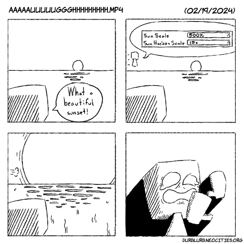
Over the past week, we've gotten quite the amount of development media! First of all, let's take a look at something a little on the fun-side of things:
Credit: sofa for the ferris wheel, Toriel for the video
If there's anything you need to know about me, it's the fact that I always love pieces of development media that showcase something pretty cool like this. This right here is what I live for (not really but it's a pretty good contender). While this may be a simple build in itself, it's actually quite telling of how well the physics joint system works in Brickadia in being able to be used like this. I imagine how this was set up was by having the stand for the ferris wheel be set, placing the ferris wheel inside of that, and then planting the gondolas in there. Simple enough, but what I find particularly interesting are two things: the fact that the gondola is more inside the wheel, and the fact that you can see the gondolas are connected with TWO physics joints.
While we have known for a long while that physics objects and vehicles aren't going to have square collision objects like how some games handles user-generated content (aka Garry's Mod, square collision object my beloved), this really sells just how much you can put in a moving physics object. Additionally, the gondola connections are usually something we don't see when it comes to development media, the last time I even remember seeing a connection even be similar to that being a rotary-to-linear mechanism made to showcase motorized joints:
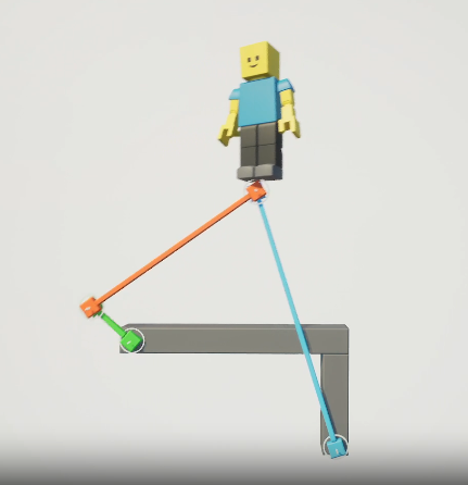
Credit: wrap
While that piece of development is quite old, for me, it shares a similar feeling, that feeling being how was this connection made. With the ferris wheel video, I get a now-I'm-getting-an-idea feeling. I imagine that with joints that are already placed, anything that is placed there automatically makes the connection, regardless of whether or not it's connected to something else. In other words, if there is a brick object placed in between two joint connections to where the sides of the brick object touch each one to where a connection could be possible, the connection is just done the moment the brick object is place. The concern I had was whether or not it would automatically only stick to one connection in a janky-game kind of way, but from what I can see here, for a connection like this for the gondolas, I would have to conclude that it is just an automatic connection, and that Brickadia does not have an issue regarding multiple joint connections for the same object.
Anyways, take a look at one of the developers going Sonic speed:
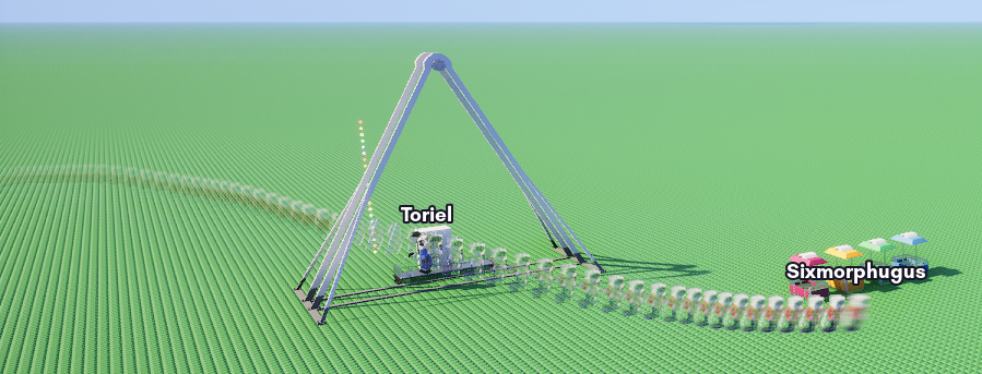
Credit: Sixmorphugus
"Durb, you said you were going to talk about some UI stuff, where is it?" Okay, let's touch on that now:
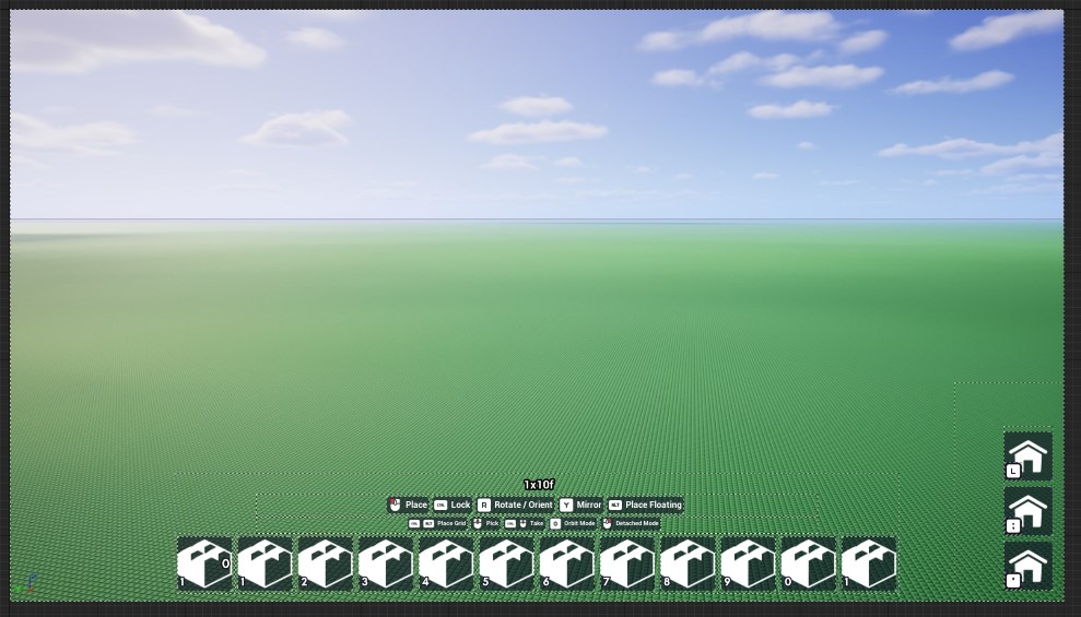
Credit: Sixmorphugus
What we're looking at here is a mock-up for some potential new building UI for Brickadia, but now let's compare that with the current building UI:

Credit: Sixmorphugus
While it may be heard to see, the mock-up has the inventory slots beveled, and the text for building now have backdrops to them. While I imagine the icons on the right are the ones for building, similar to the hint HUD on the left in the current building UI, it is interesting to see how it's only 3 slots, so perhaps the idea behind this was cutting down on how much is shown to the player in terms of what needs to be shown vs what doesn't need to be shown (I don't think the player needs to know what button emotes are tied to for building). One thing to note too is that the button mappings for those slots are (L), (;), and ('). While these might just be random, it is interesting that these buttons are where they are, right next to each other on the keyboard, so perhaps there is some incentive to have something be mapped to these buttons. Then again, it is just a mockup, those buttons could've literally been mapped to POO or MOO for all we know and it'd be whatever (except that's using two of the same letters).
While that's as much as we'll look at for now, let's take a look at just one more thing that came to the community's attention recently:

Credit: Sixmorphugus
I mention this because it does make some sense as to why it would be changed to "coming soon" when there isn't an exact date. As a matter of fact, you can see this change right now on Steam!
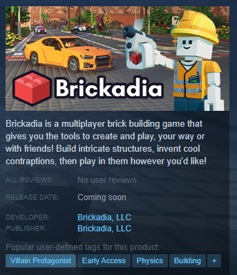
Credit: Steam
But I also mention this because while this is just a small change, it really could've just been left vague with the general estimate of year-quarters despite the fact that there is no exact date. That is somewhat the purpose of a vague date like release qaurters, and for me, changing it to To-Be-Announced gives the impression of that while there is a general estimate for a release date, it's not a confident estimate. I'm guessing this was probably known beforehand, so part of the reasoning, I imagine, to changing it to To-Be-Announced was to avoid having people pinch the developers about the game not being out despite the release quarter being here on top of no exact date being here. Of course, I still believe the game will come out mid-year, and this small change at least clues us in on how they're going to handle information regarding the release date.
But who really knows, I just kind of ramble sometimes. And who knows, maybe I missed a big piece of information, or perhaps there might be a clarification. Let me know if there was something I missed or if I need something explained to me, my caveman cranium can be a little thick sometimes so I'm always open to more information about these sorts of topics!
On next week's speculation agenda, we'll be taking a deep-dive into the new building controls being done by Sixmorphugus and all the new tricks we'll be getting for placing bricks!
And that's all for this week of the durb blurb!
If you want to see your creations, ideas, and speculations highlighted on the blurb, contact me at: durb#3215
You can also support me on my Patreon using this link here: Durb Blurb Patreon (www.patreon.com/durblurb)