Welcome to this week's blurb!
Kept you waiting, huh?
Before we get into things, let's look at that banner! That monster of a banner is actually 196 frames of animation, totalling out at about 3 MB and about 9 and a half seconds worth of animation. You may be wondering why the heck something as simple looking (but very cool looking) as this could even be that long? Short answer, it takes a lot of frames for letters to pop out one by one, so you wouldn't be wrong for thinking something's off here, but that's the price you pay when you want smooth transitions and animations. The funny thing with this banner too is that it was actually the wrong size at first! Interestingly enough, for some reason, the one thing I forgot to do was actually make the banner the right banner size, which is typically (1000x300) in terms of size, but I made it (400x125). Now, normally this isn't an issue, sometimes for pixel-art banners, I usually have to downsize the banner at worst to a size that can upsize smoothly to (1000x300). For example, (500x150) translates to that as I can size it up by scaling it by a factor of 2, and (250x75) also works as I can scale it up by a factor of 3. However, when the factor I am scaling it up ends up a non-whole number, scaling up the image results in pixels being misaligned, distorted, and all around messy in appearance. So, as a last minute addition, I extended the banner by (100x25), giving it a cool border reminiscent of a pretty cool console (but legally distinct so as to avoid the ninjas, if you know you know).
Now, with that out of the way, apologies for the big delay! No blurb for a week? Crazy! Someone even told me today they were going through blurb withdrawals, which is pretty funny for me. Maybe not for them? Either way, as I mentioned in the brief shoutout last week, I had to delay it as a result of an out-of-no-where wild work schedule that conflicted with the time I use to make blurbs. Right now, we're back on track, don't expect a delay any time soon (unless I'm stupid).
Another thing too, we'll be hitting the 50th blurb next week! Keep your eyes out for that special occasion, I already have a neat banner planned out for that in my head.
For this week's speculation, we'll be taking a look at something small. Now I'm aware that a new development blog is out (of to which I will briefly link here: Devlog #6 - Upgrading the Building System, Part 1), but I think it's better saved for next week for a nice, long blurb.
Now with that out of the way, let's take a look at what the community has been up to for the past TWO weeks!:
I see we're off to a great start, the community is so talented!:
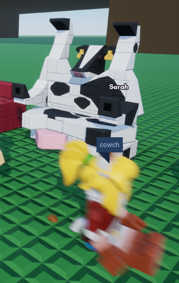
Credit: me lol (build by Grarrg, cow by Toriel)
Despite my extreme voter intimidation tactics, Agricultural Fantasy won-out the community themebuild vote:
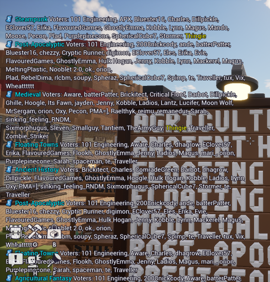
Credit: Thingie
My favorite thing about Brickadia is how people will sometimes make joke servers like this, it's absolutely gloomy but it's hilarious:

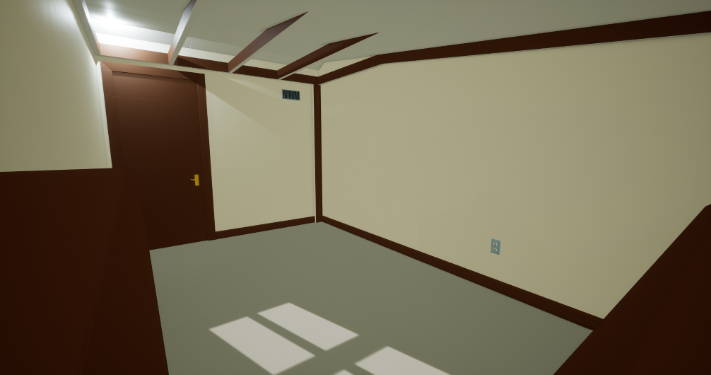
Credit: reimu
durb couch:
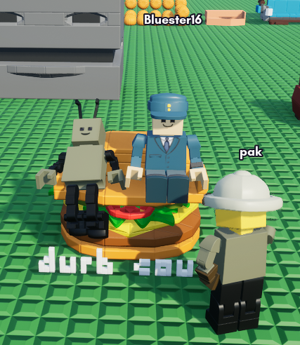
Credit: me lol
I can't trust him:


Credit: explicit
Miniature space fleet:
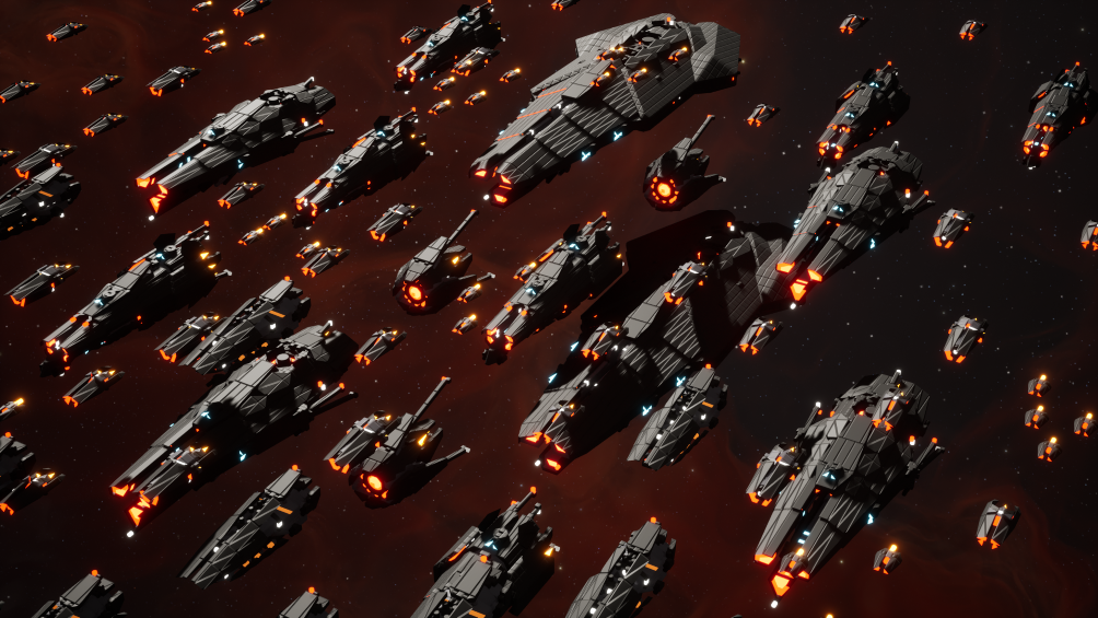
Credit: Kevin
He can't take the next step with Brickadia until it actually releases, poor guy:

Credit: Zoid
In Brickadia, you can be anyone! An absolute freak, an ordinary guy, and a man who potentially dabbles in legally questionable activities!:

Credit: recarion
A great house on the agricultural server:

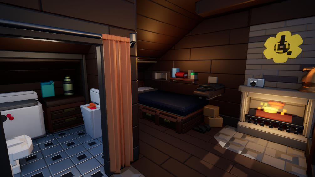
Credit: cornfarmer25
teh hobbit:
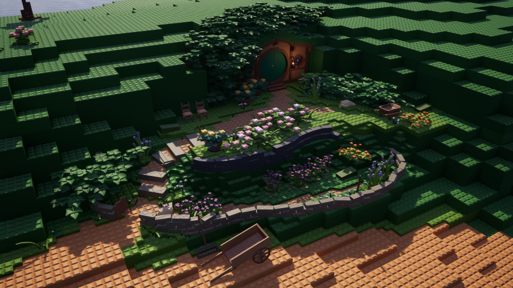
Credit: orion
Recently, I made an absolute masterpiece of an avatar that utilizes the backside of the avatar, creating what looks like a man with a huge head, mouth, and chin! I call him Stephen:
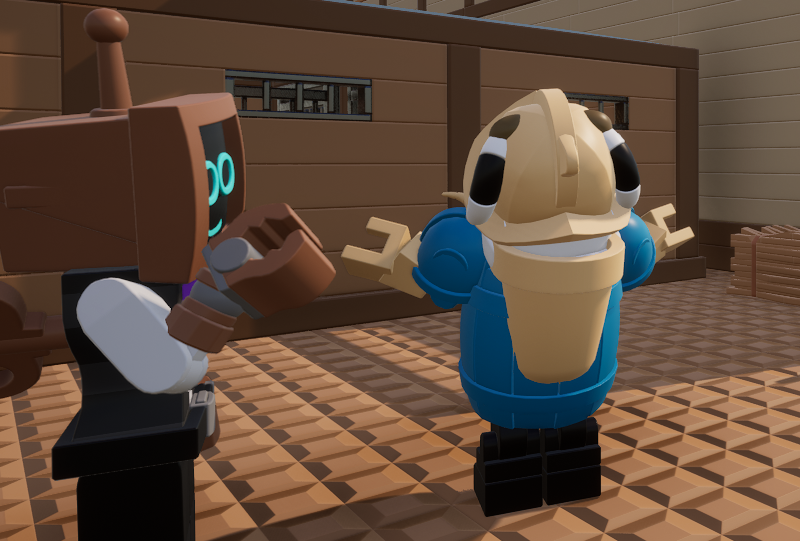
Credit: me lol
At least they get to keep all the space to themselves:

Credit: LegalizeVaporwave
Avatar abominations:


Credit: Me and Grarrg (Moonkey for the screenshots)
How the tables have turned? Or, uh, what's happening here?:

Credit: Bluester16
Masterful slope work:
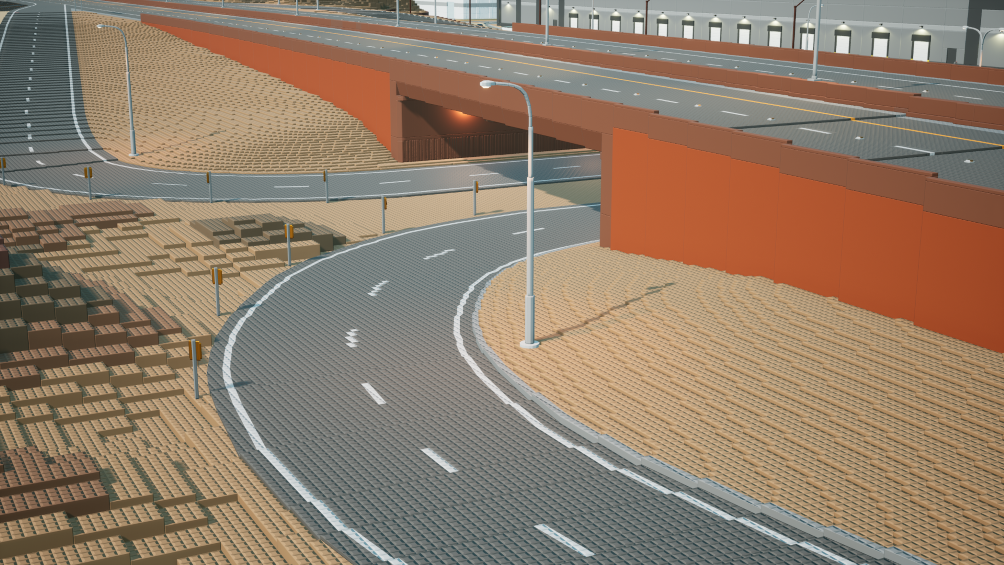
Credit: Brickitect
Pikmin fans, it's time to rise up with this cool hypothetical concept model! :
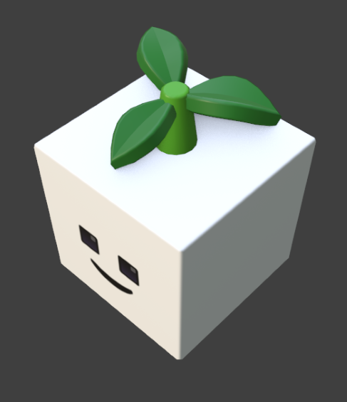


Credit: DessertSource
Brickadia for Windows XP:

Credit: Thingie
Tablebuild, anyone?:

Credit: Magus
Now we arrive at this week's user column!
Each week I will be asking members of the Brickadia community a question relevant to Brickadia at the moment, whether that be in regard to development, speculation, or even just hopes and desires surrounding the game itself.
The question this week is:
Given the multitude of graphical additions and improvements we've seen through past development blogs, what are you hoping they can improve or add on the visual-side of Brickadia, graphically speaking?
"Proto lumen and all the optimizations shown are already pretty great and seem to be highly performant, I hope they work well and have settings to crank up the visuals as well if we want some eye candy, and more avatar customizations and microbricks if those count as visuals, [plus] more emojis too PLEASE PUT :AGONY: IN DA GAME."

"I don't know if this is a real answer but I honestly think the game looks amazing right now and visually doesn't need a ton of improvement. I'd like to see more experimentation on the audio side though, as sound is an overlooked aspect of presentation. I don't think the game is lacking in that department per say, but I think there's plenty of room to experiment and add on to."
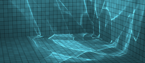
"Beyond just better global illumination and ambient occlusion with lumen; I'd really want to see water caustics added in some form, especially whenever they get around to adding placable water volumes. By the way, here's what caustics are, just for reference."
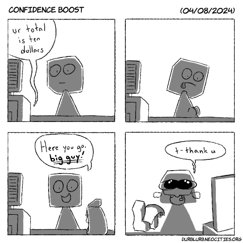
And now for the weekly comic panel!
The more blurbs I do, the more I run dry on things that I could possibly write stuff about!
Now while there is a new development blog to analyze and give a simplified synopsis for, I think that's better saved for next week for a nice blurb read.
But what will we cover this week?
For this week of speculation, I thought we could do something a little fun, and take a look at a lot of the suggestions posted in the #suggestion channel on Brickadia's official Discord server! I think it'd be nice not only as a shoutout for some ideas, but to really think about what that would mean for Brickadia, or what that could entail for the community in the future.
So without further ado, let's get into it!

Credit: Kepler
Now I find this one to be quite interesting as it's directly tied to the space map in Brickadia. Personally, I'm a fan of this. The biggest thing to avoid, however, is feeling nauseated when it comes to building or even exploring. But personally, that's just a perk of any space-based game that involves complex manuevering. While it could be a stretch that this would ever make it into Brickadia, we have heard small snippets about the state of terrain being a possibility in Brickadia:

Credit: Toriel
While we need to wait for confirmation on terrain itself being added, were terrain to be added, the idea of making terrain in space to make small celestial bodies, planets, meteorites, and the like would be huge. And given the suggestion for something similar to how Space Engineers does movement in space, these two things would be excellent to mesh together. The biggest potential issue that would arise with implementing controls like this would probably be the math behind it. Now rotating a character and camera isn't THAT bad on the coding side of things, but if you did want the additional bonus of custom terrain gravity for different bodies in space (which I feel would be the next natural step), then that's where the math issue comes in. Physics ain't easy to make.
Next up:

Credit: Kokonut
I am absolutely behind an idea like this. Now picture this, imagine if you were in a server themed after a specific era. All cool and dandy, but the only problem is no one dresses like the times! In a weird way, while it doesn't outright kill the engagement in a themed build, it does feel a little odd. By adding something like team uniforms, that's how you could manage something like that. But you might be thinking to yourself that even if there were forced cosmetics, you would at least want some way to customize yourself within whatever theme or game you're in while still fitting in. That's why I think that for an issue like this, you could probably have it be the case where you could have a set list of forced cosmetics instead of having one that you're specifically forced to wear.
In regard to this suggestion, however, it specifically describes avatar modifiers and the ability to define them. You didn't think I actually ignored what was being said, did you? Now, what does "define avatar modifiers" mean? While team uniforms takes care of one issue, avatar modifiers would be in regard to ideas like being splashed with paint with a paintball gun. Whether it be as a result of a status effect, going through a door, or even clicking on an object, being able to define avatar modifiers is what would help enable that. Being able to define what those modifiers could be is a very creative idea, especially for ideas like a t-shirt cannon that forces people to wear outfits. Being able to define the avatar modifier would take care of what the player wears from that cannon, if it were the case that you could customize what people would wear from that item, to put it into perspective.
Lastly, let's take a look at this suggestion:

Credit: FlavouredGames
While I do believe there is a potential style issue with this idea, I believe that this idea is fine in regard to particularly small builds, or even gaps. Picture this, you've made a huge build filled with microbricks. Now there's your first problem already, but we'll excuse that. Now imagine you've made just the PERFECT curve using wedges and corners, but it just so happens that, as a result of a miscalculation on your part, there is an excruciatingly small gap that you can't fix conventionally without it looking scuffed. While the issue with this ends up becoming why can't the whole game just have angles change with all bricks on their corners, the idea I'm more fond of in this particular suggestion is being able to allow for nano-grid work only in regard to fixing issues like this. Perhaps it could even be something that only works for one increment, meaning the only condition that would allow for custom angles or sizing would be to close gaps, restricting people from making nanobricks while also giving a free bail-out to people who can't plan for those pesky moments. While this doesn't exactly correspond to the original suggestion, I think an extension of this kind of works out.
But perhaps my take on a suggestion like that is also janky, but what do you think? What additions or suggestions do you wish could make it into Brickadia? Only time will tell what will make it in, but this certainly won't be the last time I cover community suggestions!
And that's all for this week of the durb blurb!
If you want to see your creations, ideas, and speculations highlighted on the blurb, contact me at: durb#3215
You can also support me on my Patreon using this link here: Durb Blurb Patreon (www.patreon.com/durblurb)