Welcome to this week's blurb!
And not only that, welcome to the 50th blurb!
Time flies, huh? 50 blurbs is a lot of time, over a year of writing content, gathering pictures, asking people questions, and drawing up cutesy little banners! If anything, I'm more surprised that people stuck around this long and kept on reading, and the help and support I've recieved over the year has been more than amazing, and to that, I say thank you!
Now, you'll notice that the banner is 3D this time around, crazy isn't it? I had a huge amount of support (in the form of literal hand-holding help cause I suck at Blender) from DessertSource for everything from modeling, texturing, rendering, you name it! Hopefully you guys like this banner as much as I do, this took a lot of time to make, and it was no easy task.
For this week, we'll be doing a synopsis of the recent development blog, and what that means exactly for the community in regard to the content inside of it, and Tantiem will be helping out by covering the second half of the development blog as well. If you haven't read the new development blog, you can read up on it here on your own or stay tuned until the speculation column: Devlog #6 - Upgrading the Building System, Part 1.
In other news, a lot of blurbs have been recovered as of late, with the only ones left are the ones I have to manually restore, so everything from blurbs #1-15, #21-23, #26, #30 and #31, #33-35, #40, and #44 and beyond! Huge thanks to Orodan, Critical Floof, and Tantiem for helping me to recover a lot of the blurbs! By the end of this week, #27-29 and #41 will be recovered. If you notice dead video links, those are still being worked on, but enjoy some old blurb content with most of them now back!
Following the post of this blurb, I will be taking a small 2-week break, so expect a new blurb on May 6th, 2024!
Now, let's get into what the community has been up to recently!
What did they mean by this?:

Credit: DessertSource
The fact that the diagonal sidewalk and fence look as good as they do are crazy:
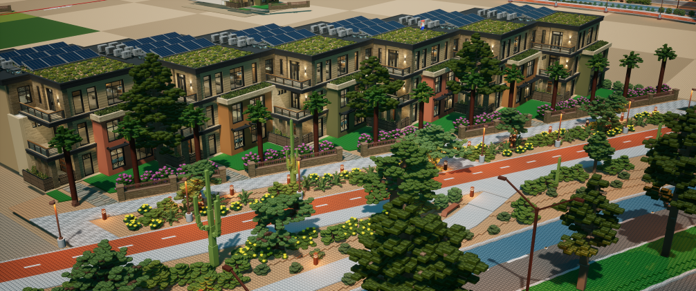


Credit: Screenshots by Brickitect, houses by Snab
I am a die-hard fan of Japanese woodblock print art, which is why I love this recreation of The Great Wave off Kanagawa:
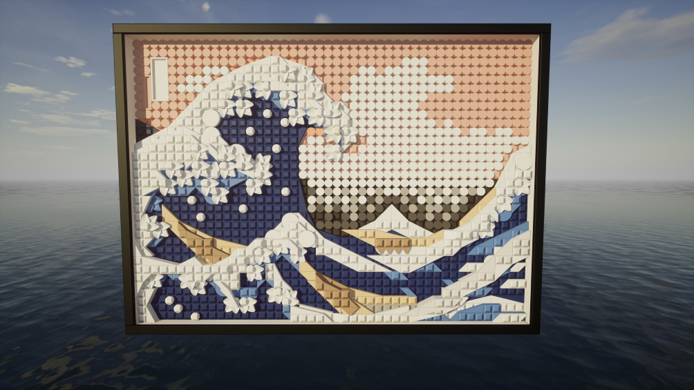
Credit: Gehenna
A beautiful build. Nevermind the player phasing in and out of existence:

Credit: Zoid
Exotic foliage and organisms:

Credit: Ladios
This bad boy can get me all the channels on TV without having to pay a penny to those satellite-dish companies:
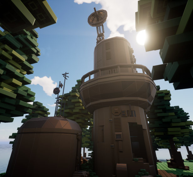
Credit: cornfarmer25
An amazing avatar that utilizes the backside of the character to create a face, stubby arms, and dentures!:
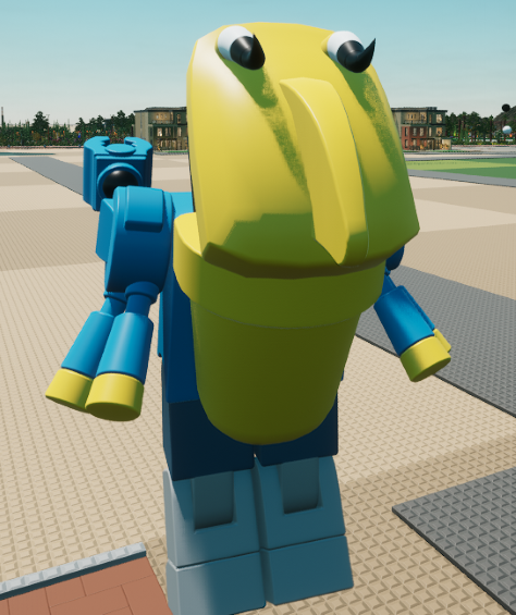
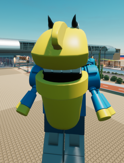

Credit: Pear to Pear
Still waiting on those wheels:

Credit: Tantiem
Another shopkeep waiting to be robbed:
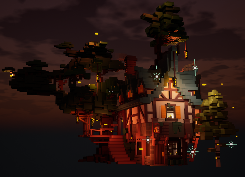
Credit: vel
"No, I'm not resting, I think I just broke my lower back, I need you to call an ambulance.":
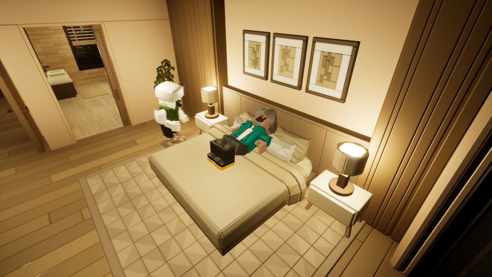
Credit: Ladios
He better watch his step, it's pretty dark in this picture:
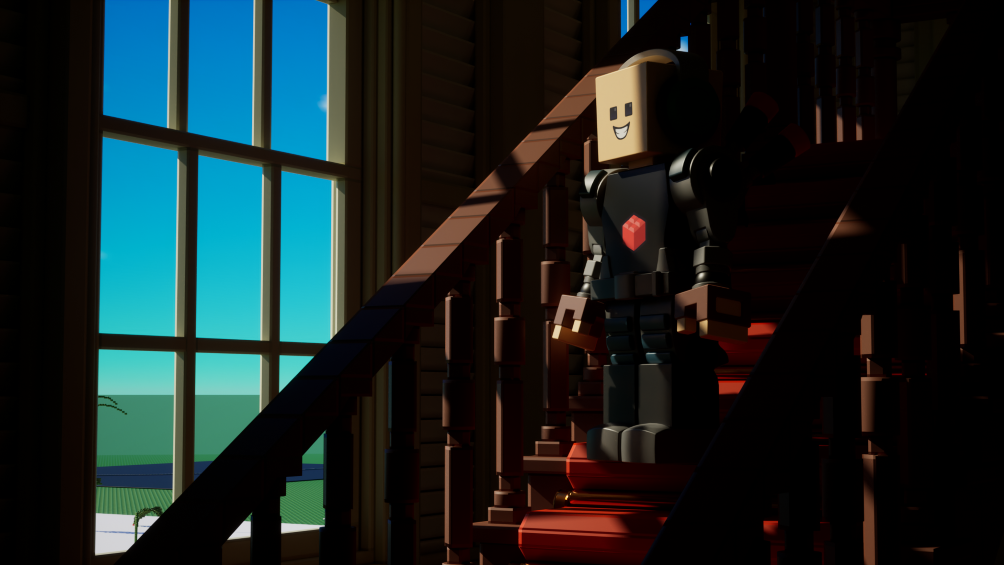
Credit: Zoid
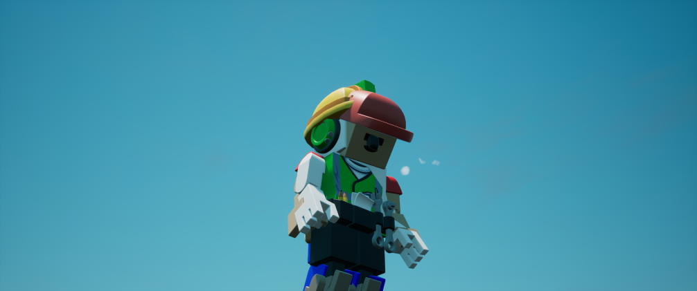
Sometimes, to get more cosmetics, you have to take things into your own hands by merging:
Credit: Brickitect
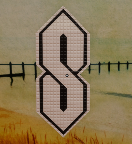
And while we're here, why not take a look at some old Brickadia content?:
Credit: wrap
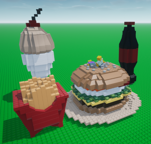
Now THIS is something I can get behind:
Credit: Kenko
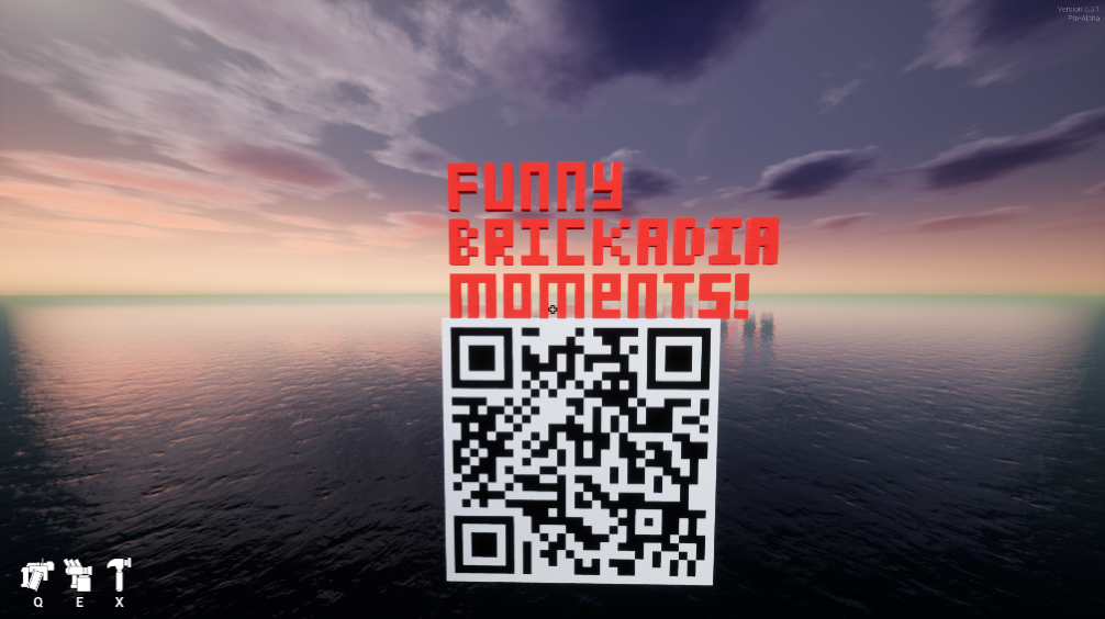
Go ahead, scan it:
Credit: Mr. Queeba
Someone has to be the one to row:

Credit: SGT.Blocky
An awesome shelf town!:
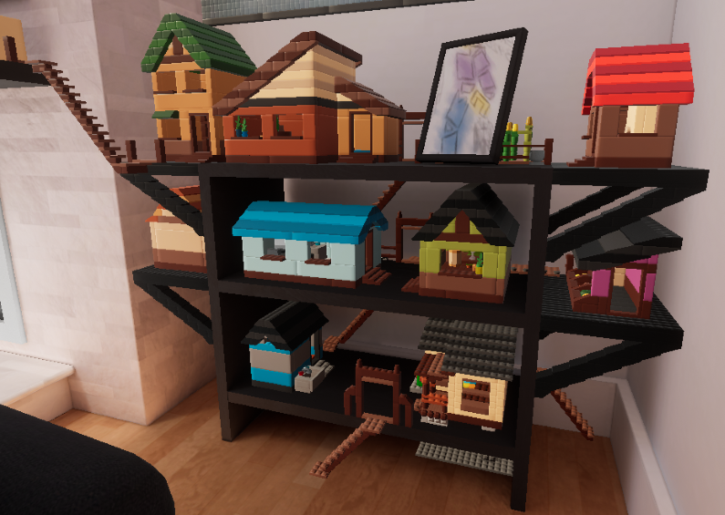
Credit: Flamecannon
I HATE MICROBRICKS:
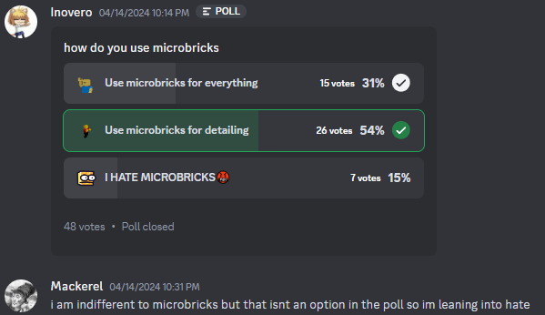
Credit: Inovero
Couldn't hurt feeding him, right?:

Credit: LegalizeVaporwave
Now we arrive at this week's user column!
Each week I will be asking members of the Brickadia community a question relevant to Brickadia at the moment, whether that be in regard to development, speculation, or even just hopes and desires surrounding the game itself.
For the 50th blurb, I'll be asking two questions!
The first question this week is:
What stood out to you the most from the recent devblog, and what building changes are you looking forward to the most?
"Definitely the rotation gizmo system. A lot of the other stuff like drag-resizing & floating brick placement looks really polished but can currently be worked around; however, hammering the numpad keys to get the correct orientation on anything is immense suffering"
"The detached building mode, which could be considered a 'legacy' mechanic from bygone days and games, is still my preferred method of building. despite the extensive work done to make the other building modes much more viable, it's comforting to know that detached mode is still receiving love. It's exciting to see all the building controls receive a redesign with user friendliness in mind! I'm sure it will take a while to adjust for some of us, but it's surely a welcome adjustment on my end."
"The features that stood out to me most is the new way to rotate bricks by dragging the mouse instead of spamming numpad / and the new drag to resize feature. I am looking forward to both of them."
The second question this week is:
What are your thoughts on the durb blurb after a whole year of blurbing? What do you hope to see from it in the future, and what changes do you think could be made?
"I've been having a lot of fun reading through the durb blurb, it's cool to see all the highlights and funny bits people get up to. For changes? I dunno! Maybe a small section on a recent bug or fun fact about the website itself?"
"In the future, I want to see a wires, behaviors and mods related special column where new breakthroughs or coding innovations are shown every month (or bi-monthly), showcasing the game being pushed to its limit. It would be a great opportunity to show that the creativity of Brickadia isn't just constrained to the builds - allowing the programmer types to display their creations on Brickadia. Another thing I would love to see is a section with a universal calendar of major Brickadia events and their dates, both community and official. (Probably a big ask unless you get someone else on board to document all those dates and names.) In terms of changes, there's not a lot on my mind. Maybe a button that points to a random blurb? Seasonal themes depending on the date of each blurb?"
"The most I'm stocked about is art. The personalization of the durbblurb, its comics, banners. I love looking at such a beauty!!! Recommendation: stay hydrated (see #30's blurbblurb comics!)"
And as a special bit:
I'll be answering some questions about the blurb itself as a small Q&A!
"what is your favourite part of the blurb creation process?"
My favorite part about making the blurb is always the animation part for banners. Making an outline can be neat and stuff, but when I'm making frames where things should be moving in some way and having it shown in that sort of way, I mean, it's eye candy. Apart from that, I really enjoy making the comics, as hard as it is to make something funny for each blurb.
"What was the actual process to make #49's banner? Obviously it had more frames of animation than I have frames of my dad...but when it comes to the banner what was different frame-to-frame compared to simpler banners, and with what program?"
The process to make #49's banner was a little tricky and very much so time consuming. The thing that's different with that banner and more simpler banners is mainly in regard to what's being animated. Anything that goes on for a specific amount of time, like dialogue, or has a certain sequence of movement, like the candle light in the background, or something even as simple as eyes blinking, require some amount of frames of animation. How smooth you want it, how long you want it to go, how it happens, all of that is involved in the amount of frames an animation will have. So in regard to this, the biggest difference is mainly in regard to what was being animated itself, which was dialogue popping up one letter at a time. For #49's banner, I used the program Aseprite to make it. It is arguably the best, if not the definitive, program to use when it comes to pixel-art, sprite-making, and pixel animation. It's worth all the money I spent on it to get it.
"How maek blurb? Du u use notepad or notepad++?"
I use notepad when I need to keep track of speculation over the course of the week, but I mainly use the built-in HTML editor on Neocities to make each and every blurb. The program I use to make the banners and comics are FireAlpaca and Clip Studio Paint. To make blurb assets, I'll either resort to paint.net or Aseprite. As a matter of fact, the background for this site was made using Aseprite too!
And now for the weekly comic panel!
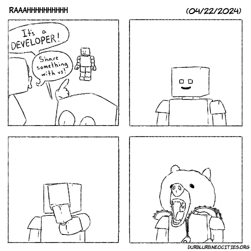
How fitting is it that for the 50th blurb, I get to cover the new development blog released by the developers? Nevermind the fact that I held off on purpose just for that, but when you get a release that recent and an occasion like this, you gotta mesh them together.
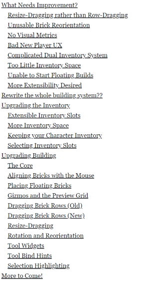
For this week's speculation column, I'll be giving a brief synopsis that kind of simplifies what exactly it is that's being said in the development blog recently released by the Brickadia development team, and we'll be going over what that means for the game.
Source: Brickadia Site
As you can see, we have a lot to get through today, so let's get straight to it:
First we'll go through the "What Needs Improvement" category:
In regard to the first section, "Resize-Dragging rather than Row-Dragging", it starts off describing how the row-dragging feature was designed around a specific use, that being for when players use regular non-micro bricks, multiple bricks would be made in a row.
Sixmorphugus then proceeds to acknowledge that for most people who build with microbricks, however, row-dragging is essentially trivial, if not grating, for some of the building done in Brickadia. This is basically a result of the Resizer tool being more useful compared to row-dragging in regard to building with microbricks in the sense that, more often than not, most people tend to place, resize, then rinse and repeat. So then, as a result, you get what is essentially a loop of switching tools constantly which, while one would thing that would be a good thing for a game about building things, in this particular instance, it actually ends up being monotonous.
After admitting that he is watching us from a rooftop, Sixmorphugus then proceeds to recognize that on top of this back and forth switching between tools, resizing microbricks on grids to be stud-sized is very meticulous with the Resizer tool.
As a solution, you'll now be able to resize bricks when placing them, and resizing bricks will be based on the grid increment.
In the next section is something that all Brickadia players are wary of, the busted and janky brick reorientation.
Source: Brickadia Site
Brick reorienting is done with the Cycle Brick Orientation button, where it goes through every orientation to be angled just right to the player's desire. Unfrotunately, each orientation, while not literally random, absolutely feels random.
After reassuring us that the Cycle Brick Orientation actually isn't random, we're told that the solution would be to make the player point at the direction in which the brick should be oriented or, in other words, make orienting bricks more user-friendly, so to speak.
In the next segment, Sixmorphugus acknowledges how the display for brick measurements is basically gibberish if you didn't spend like a solid two minutes trying to understand how it correlates to brick resizing.
Right after that, Sixmorphugus proceeds to highlight how the player HUD is a little hard to read, more so in the sense that they don't visually explain easily their exact functions. On top of that, they only display the default keybind instead of whatever it's set to, and they aren't clickable. While that might seem like a nothing issue, with how the visuals for these icons are placed despite their binds, they almost seem nonsensical placed together. It's also acknowledged that while the Painting tool hud is less of an eyesore and more navigable, the keybinds in the HUD don't show your current keybinds, nor does it show some paint functions like the fill paint function (which recolors multiple bricks at a time).
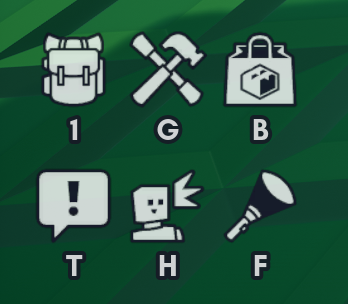
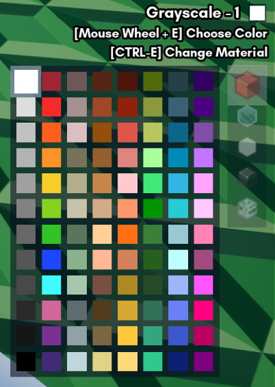
Source: Brickadia Site
After this, it's revealed that both the brick inventory and the item inventory are merging together into one inventory since some folks don't know the keybind to switch between inventories.
Funnily enough, it also describes that as a result of this merging, there is too little inventory space. To remedy this, something that has been suggested is having multiple quickbars so that there isn't the issue of items or bricks being lost to other items or bricks.
Next to this, Sixmorphugus describes solutions to the floating-build problem, where there isn't exactly a good, clean way to start a floating build in the middle of the air without resorting to janky methods or wasting time. The proposed solution is to have a float key that allows the player to have a brick float at a certain distance from them, regardless of whether or not the brick is in the sky.
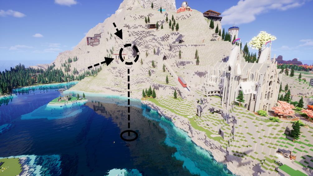
Source: Brickadia Site
In the final segment, for the building system to be rewritten, the building system itself will be modularized, or split, to where the modes themselves handle almost everything.
In short: the Control Modes handle user input and visual outputs on the HUD, the Alignment Modes handles placement grid behavior, and the Placement Modes handles how bricks are placed.
It's also revealed that there could potentially be custom alignments, as well as different drag-modes for building, such as circle-drag or frame-drag (think of it like making a circle or a box on MSPaint).
In the next category, "Rewrite the whole building system??" (that's not a mistake, there are two question marks), Sixmorphugus outlines some of the reasons why they want to rewrite the building system:
For one, the current code for building and inventory is basically spaghetti code, which in itself makes adding or removing anything a mountain of a task. Additionally, the current code being tailored to ordinary bricks, adding special bricks and objects becomes extraordinarily difficult. Since the inventory system was client-side, this prevented the developers from adding prefabs into the quickbar from the Gallery and other features. Not only that, with the lack of organization, you ended up with code that, while basically spaghetti, was also somewhat unreadable due to the amount of functions and variables involved.
After describing how managing the code felt more like playing a game of Factorio than actually coding, Sixmorphugus describes how the prototype tools for allowing physics contraptions also necessitated the building system rewrite.
Go ahead, fix it:

Source: Brickadia Site
So with this, we go into the meat of the development blog, "Upgrading the Inventory and "Upgrading the Building."
First off, we're told that the Brick Inventory in Alpha 5 isn't real. Paranoia about what is real or not aside, we're told that while the Item Inventory is an actual inventory, the Brick Inventory is just graphical elements that contains references, which "links" to bricks in this instance, to change what's being placed. In other words, it's a brick-changer that just let's you change the references on the icons.
To alleviate our concerns, the fake Brick Inventory has instead been removed and instead merged into the Tool Inventory.
However, since this merging of inventories basically means that you can also lose all your bricks when the player dies alongside all the items in your inventory. To cover for this, a new feature, Keep Inventory, is a setting you can turn on, both in a minigame and outside a minigame, that keeps the player inventory.
In the next segment, we finally get a good look at what these new quickbars look like, which can be switched around by either CTRL-Scroll or CTRL-[0-9] manually.
In the next segment, it's described how the developers wanted to add client-side prediction to the inventory system, which, to explain briefly, is a way to make the game feel more responsive in the face of high-latency. They could only do this with a single byte, so they used an inventory index with a limit of 256 values (from -128 to -127) to represent the different inventory slots, where 0 is being not equipped, -1 is a special TEMP item brick, 1 to 100 are inventory items, and -2 to -101 are those selected items.

Source: Brickadia Site
Now with upgrading building, Sixmorphugus started with the core of the Placer tool, the state machine, which to explain briefly, is a behavior (no, not THOSE behaviors) model that is made of states and transitions, where because of an input of buttons, we're able to transition the state of the Placer tool to allow us to change how we move a brick. In this particular instance, the state machine for the Control Mode is added, to where C switches the alignment mode, J switches placement mode, and holding C selects what the development blog describes as the "special 'super' alignment mode."
While writing this synopsis, I ended up taking a small nap inbetween bits. All of a sudden, my PC was very jittery and slow, and that's when I realized the source of it was the development blog taking up a lot of memory. I can see why the developers say be wary when reading on mobile, but I didn't realize I had to watch out while on PC. Though this may be a me-issue cause my PC is garbage.
Continuing on, in the following segment, Sixmorphugus describes the complexity of using the mouse position to determine the placement of bricks. Following this, a number of conditions are described on how the final brick placement should behave, making reference to how it should be on a grid, can't intersect with other bricks, have the correct interactions with other bricks, orient itself onto the brick, and so on and so forth.
Following this, Sixmorphugus describes how they take the raycast fired from the position of the mouse to properly position a brick on where it should go. To do this, they grab pieces of information on the brick grid being interacted with. After that, they can now snap bricks onto grids. However, for anything larger than a 2x2 microbrick, the brick ends up intersecting with the surface being interacted this.
To remedy this, they program it to where it into consideration the frame (the box) that is the brick and repositions it based on the size of the box.
After that, it's described that while this does work, it doesn't work so great when placing large bricks that have one small end that would connect it to a bottom surface, so they updated the alignment to where the bottm ends of tall bricks acts as a pivot for proper alignment.
Source: Brickadia Site
For implementing floating bricks, the player will now be able to hold the ALT-key to do so, and by using the mouse scroll, you can edit how far the brick is when using the ALT-function.
Following this, it's revealed that the building grid has been reimplemented as an interactive visually-rendered element; a gizmo. With that, it's also revealed that a gizmo manager was created to allow for the making of other gizmos as well.
Now for the second half of this synopsis, I'll have Tantiem cover the rest, and then we'll circle back to some closing thoughts from me:
Fantastic work Durb! anyone who reads this far make sure to tell Durb he's super totally ultra rad. Continuing from here, it looks like I'm starting off with the amazing new placement mechanics! After that, we will talk a little bit about some much needed UI improvements, a touch on highlights, as well as what to expect next!
In this new section, we start with the row dragging elements. This has been split into two sections: axis repeat place, and resize place.
X,Y, and Z axis row drag repeat placing. You heard me right! Not only did our one dimensional row drag repeat place technology get upgraded to be planar, but jumped another dimension and became rectangular! It may seem basic, but the monstrous effort to get this to work was really anything but, as Six himself described this as the number one most complicated part of redesigning the building system thus far
Potentially everybody who ever took a shot at building in the alpha builds with existing row drag capabilities knows the pain: drag for a while in one axis, and have it suddenly swap up on you, either jumpscaring you by row dragging right into your face, or by flying way off in to neverland, or possibly even randomly jumping axes for seemingly no reason!
And next, let me try to explain simply why this was happening, as noted in the post. Basically, three intersecting planes (math, not flying) are generated from your drag start point that each intersect two axes (XY plane for lying in the X and Y axes, for example). Next, a line is drawn from your face to where you aim (eventually to the ground), and everywhere that line intersects a plane is considered for the last step. Finally, the axis closest to either intersection point is chosen as the drag axis. Pretty smart stuff if you ask me.
I found the solution to this problem especially interesting. Once again, very, VERY simply put (read the full post for your homework), it is essentially the same approach, but all the lines got converted to be relative to screen space, instead of world space. Another fix implemented was to have special detections in place for when your face is relatively close to one of the axes, to prevent the aforementioned jumpscaring.
Now, for the best part (in my opinion, at least!), resize-dragging! (this would be an appropriate point to explode from excitement)
Taking advantage of the previous work to fix the intuitivity of brick dragging, resize-dragging combines the extensibility of the resizer tool, along with the action packed nature of the placer tool into one handy-dandy machine. Now, when click dragging with the placer, there is the option to either drag repeat place, or drag resize place, which allows you to place a brick AND resize it, at the same time! Wow! It even supports the new triple-axis functionality we talked about earlier. Groundbreaking stuff really.
Pretty much everyone I have ever talked to has the same thing to say about orienting bricks, which is basically the builder equivalent of "spray and pray". As mentioned before, the solution to reorienting bricks is better than ever now, utilizing the same powers of nearest-axis detection as before to allow us to 'aim' the way we want a brick to be oriented. Simply hold R instead of tapping it, and instead of a rotation, we get aimed orientation!
Last but not least, we have some major improvements to the UI for building controls. As it is right now, a lot of the building UI is really not necessary, maybe even a little confusing for some. Now, tool hint UI responds dynamically to what you are doing, and new resizable widget icons have been reworked to be more intuitive for cycling options (grid size, drag mode, etc...). As a final sidenote, selections now have outlines depending on the action you are performing (white for building, red for delete with hammer).
Zeblote may be next in line to present us with some brick game related bangers, but we know that the next time we hear from Six on the blog, it's going to be about building with physics constraints, locking modes, orbit mode controls, and more! Exciting stuff! back to the blurb himself.
Thank you Tantiem for covering that second half!
Now we get to this part, what this means for the community. Generally speaking, a lot of this recent blog has mainly been reworking the building system into something that is not only JUST better, but something that is of actual, literal convenience. Fixed row-dragging, different modes for building, a lot of what we see here is not only serves as an expansion of what we already have, but also a bigger array for customizability and personalization when it comes to building in general. That in itself is something that I think is very important for a game that is pretty much almost all about building. I could not tell you how many times I even tried to reorient a brick and just had to go through it again and again, or how many features there were that I knew existed, or the shortcut was busted or I just did not know was a thing. All the grievances that could be had in Brickadia about the way building works, this development blog and the recent work on Brickadia's building system addresses that, so you can expect major quality-of-life improvements as a result of this and what will come from the second part of this development blog (yes, the next development blog will be about building once again.
That pretty much covers the speculation for this week for the development blog, but what about blurb speculation? What can we expect from the future of the blurb?
For one, I am surprised I have gone as far as I have on the blurb, posting weekly is not an easy task. You've seen me delay the blurb many times either cause of work, scheduling conflicts, medical emergencies, or the fact that I just needed more time to get everything right. So one question that someone might thing is "how long will the blurb continue?" To that, I'm not sure if or when the blurb will end, people really enjoy it, and that gets me going. The only problem is that because I work on the blurb weekly, it doesn't leave that much time for me to pursue other projects with a dedicated amount of hours. But I can gaurantee at least (or I at least hope) that the blurb will definitely reach #100.
Apart from that, in regard to blurb features being made, I'm planning out a couple right now, one I've been trying to cook for a bit, just haven't gotten around to it, and I'm always thinking of other ways to renovate the site or at least improve it in a way that's eye-catching. But from me, thank you, the reader, for being here for the ride so far, there's a lot more to come in the future, a year of blurbing but we're only halfway 'till #100!
Anyways, see you guys in 2 weeks, time for a small break!
And that's all for this week of the durb blurb!
If you want to see your creations, ideas, and speculations highlighted on the blurb, contact me at: durb#3215
You can also support me on my Patreon using this link here: Durb Blurb Patreon (www.patreon.com/durblurb)